There Is No Skin-Tone Recipe. Here Is What I Do Instead.
Sep 28, 2026
If you have ever struggled with mixing skin tones (getting them too orange, too grey, too pink, or simply not knowing which colour to reach for next), or if you have mixed a colour that looked perfect on the palette, put it on the canvas, and suddenly it felt completely wrong, I want to tell you something first.
It is not you. It is how colour works.
Skin is colour, and colour changes with light
Skin, when we strip everything else away, is colour. And colour is heavily affected by light.
Light can make a colour appear lighter or darker, but it can also change the colour itself quite radically. A brown can suddenly look yellow. A deep violet can become lilac or grey.
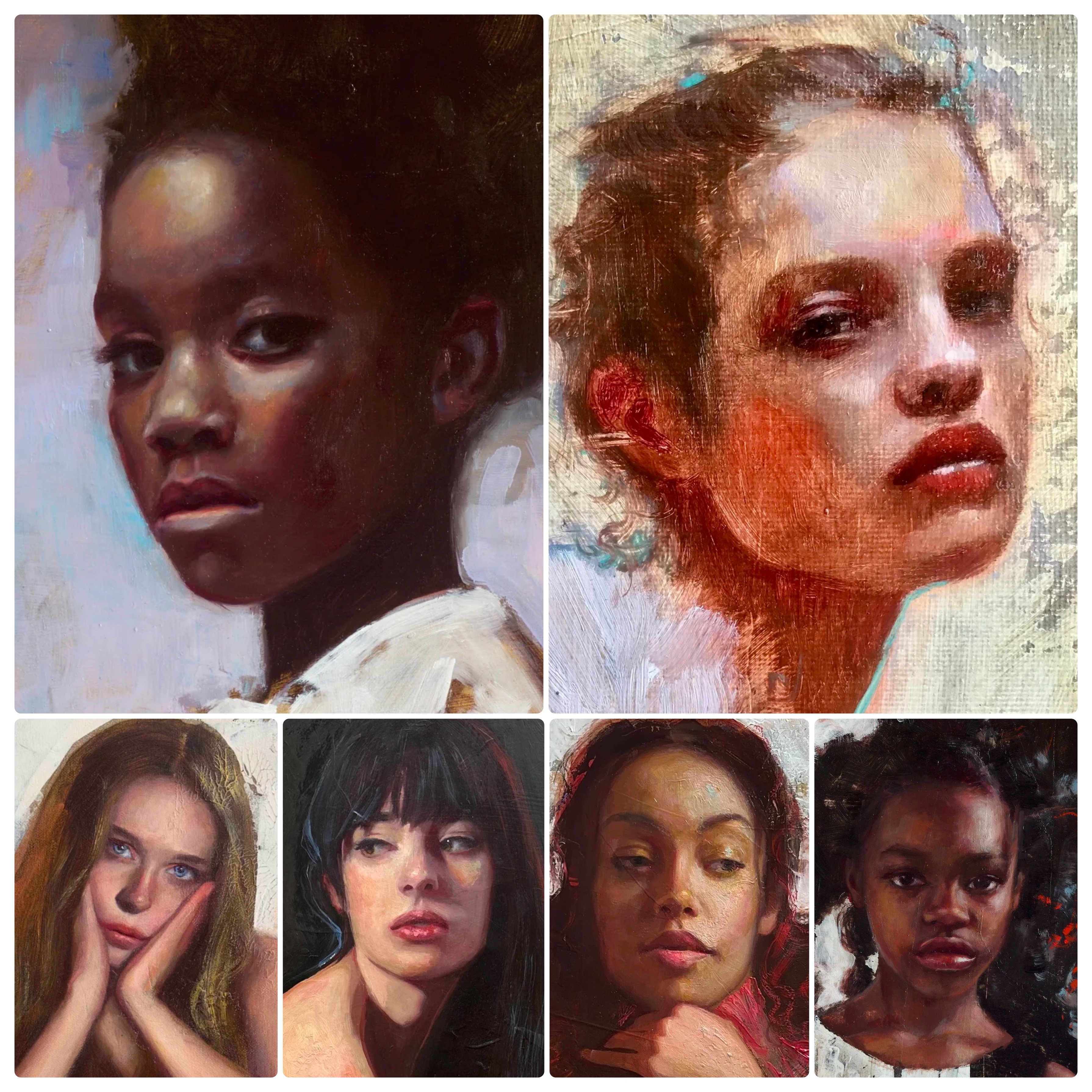
Look at these two photographs. It is exactly the same model. Same person, same skin, but the light changed. And suddenly what I see as a painter is completely different.
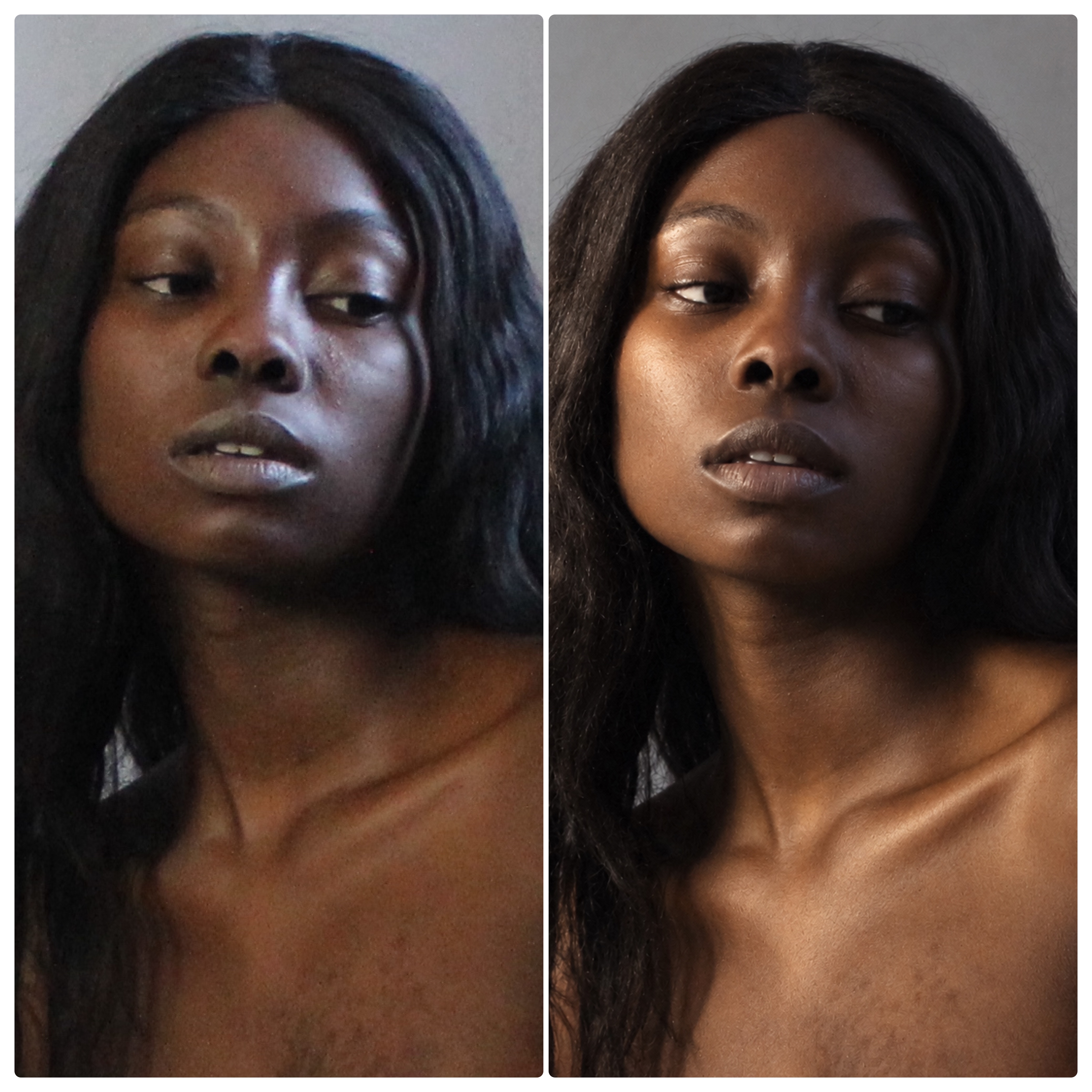
So there is no single skin-tone formula that you can learn and then repeat every time. There is no one recipe for pale skin, one for olive skin, one for brown skin or one for dark skin. There are too many ways in which light can interact with the skin.
I have been painting portraits for over seventeen years. During that time, I did not learn skin tones by memorising fixed recipes. I learned how to read skin.
First, OBSERVE
Whenever you start a portrait, whether from a photograph or from life, spend five, ten, even fifteen minutes simply looking. Before you reach for any paint, ask yourself three questions:
- What colour do I see?
- What is the light doing to it?
- How is the surrounding affecting it?
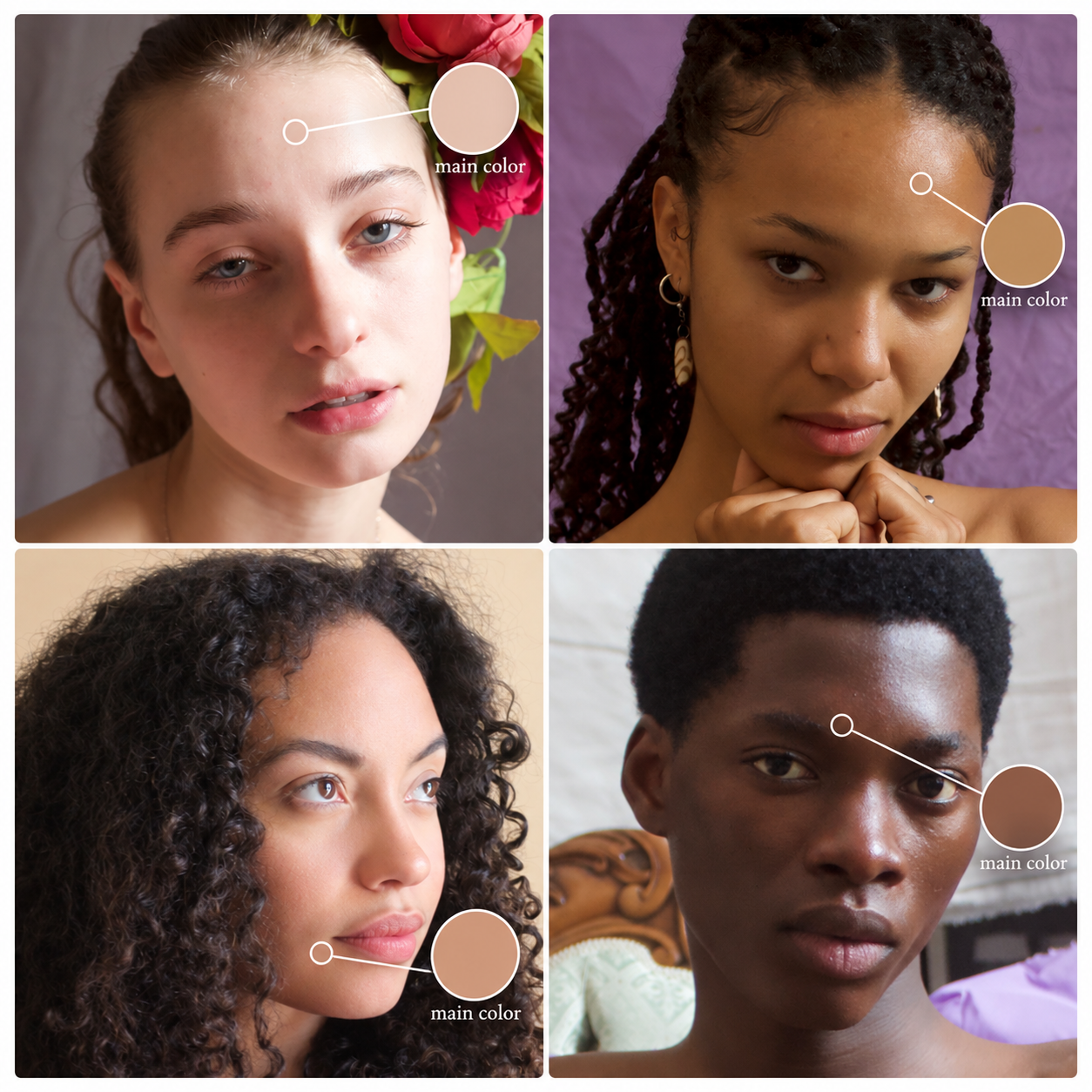
1. What colour do I see?
Look at an area where the light is not dramatic, usually a mid-tone. The colour you see there is the identity of the skin. That is your base colour.
Match it on the palette first, before you touch the canvas.
2. What is the light doing to it?
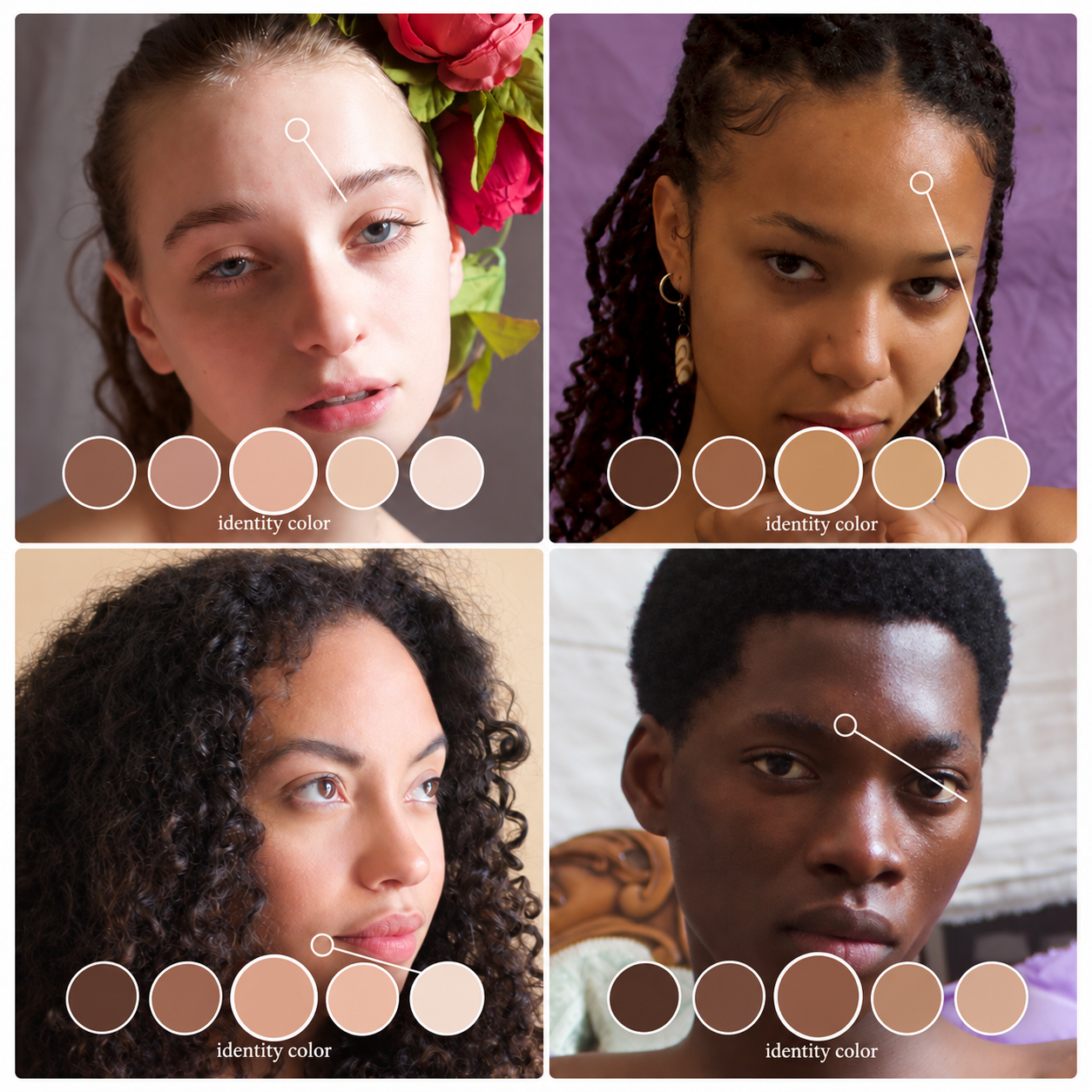
Find the direction of the light. The strongest highlight is usually a very good clue.
The part directly hit by the light is the lightest. As you move away from it, the skin becomes darker. But the colour itself changes too. Very close to the strongest light, the colour can look almost bleached out. As the plane turns away from the light, more colour comes back, sometimes strong warm or red accents. Deep in the shadow, you lose information again, and sometimes the form too.
So from your base colour, move out gradually. Towards the light, a little more yellow. Towards the shadow, a little more red, or a little black. Always judge it against the reference.
The common mistake is to go straight into the light and add a lot of white. White washes the colour out, and you lose the base colour entirely.
3. How is the surrounding affecting it?
The way we see colour is not absolute. It is relative to what is around it.
A highlight can look almost white because it is surrounded by darker values. Take that same colour out of the photograph and it is often a dull, slightly pink grey. A shadow that reads black is often a warm brown.
This is why a mixture can look right on the palette and wrong on the canvas. You did not necessarily make a mistake. You changed the relationship. (I wrote more about this in Colours Don't Exist in Isolation.)
So here is the rule I use: your eye exaggerates. Mix slightly less than you think you see (less light, less dark, less warm), put it down, and let the colours around it do the rest.
Dark skin is not one colour
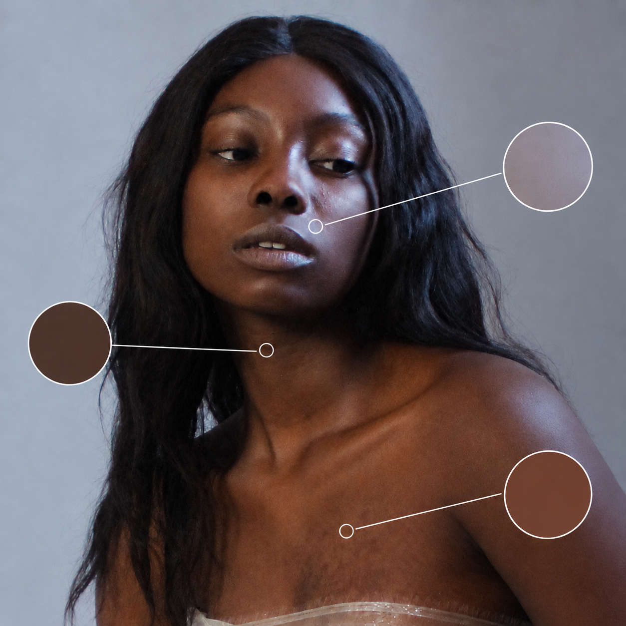
We might look quickly and think "dark brown skin", one colour. But look at how many colours there are. Squint, and in this photograph I see three large colour blocks: a very deep block in the shadow, a reddish-orange family, and another family in the light.
So I mix the three separately, then work out what happens between them. The darkest I mix from Ivory Black and Cadmium Red. The second with more red. The light area is cooler, and it looks lighter than it is because it is surrounded by dark skin.
I build all three from the same small group of pigments. That keeps the colours in harmony. The unity does not come from pretending the skin is one colour. It comes from letting the colours change while keeping a relationship between the mixtures.
What about warm and cool?
I am often asked this. At the beginning, I concentrate on the main colour (hue) and the value: where it becomes lighter, where it becomes darker. Temperature comes after. You can see value by squinting. Temperature is relative: until I start laying colour next to colour, I cannot really see it.
So: find the base colour, get the value and the intensity approximately right, and start painting. Then you begin to see that this area is not only lighter, it is also warmer, and that one is darker and cooler.
Thinking about warm and cool on the palette at the beginning is distracting, and it does not help the process.
Observe, guess, place, adjust
You observe. You make a guess. You place it. You look again. You adjust.
You will still get some colours wrong. I do too. The difference is what you do next. Instead of thinking "I have ruined it", ask what exactly is wrong. Is it too light? Too warm? Too intense? Is it the colour next to it that is wrong? When you can name the problem, it stops being a disaster and becomes a small change. More white. A touch of green. A little more red.
And this can be trained. You are not born seeing this. You train it by mixing, placing, comparing and adjusting. Every time you do it, you see a little more.
Thank you for reading. If you want to start from the structure of the face, download my free guide, Before You Paint the Face. It comes with a private price on COMPLETE.
Download the free guide →
Did you know you can learn with me both online and in person?
Enjoyed this article?
Subscribe here to receive practical painting advice and more arty news.
No spam. Only thoughtful, carefully written content.