Colours Don't Exist in Isolation — That's the Problem. And the Solution.
May 03, 2026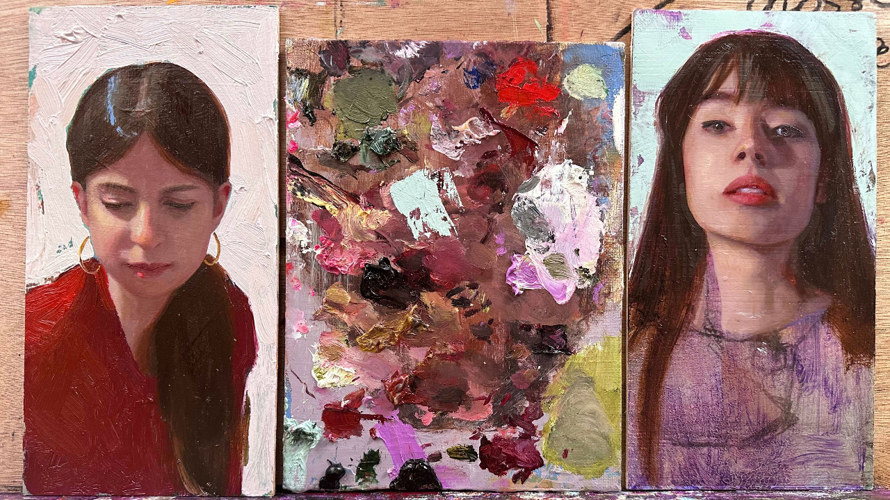
I recently painted two small portraits in the studio. Simple pieces. But they became a very clear reminder of something fundamental — something that sits behind almost every frustration painters face.
Colour is always relative. It doesn't exist on its own. It only exists in relation to everything around it.
This explains so much. Why colours get muddy. Why you can't replicate a result even when you use the exact same palette. Why a shadow colour looks completely different once you've put the lights in around it. The answer is always the same: the context changed, so the colour changed.
You can have the perfect premixed palette — but change the reference, the lighting, the ground, the surrounding colours, and everything shifts. That same mix will read completely differently.
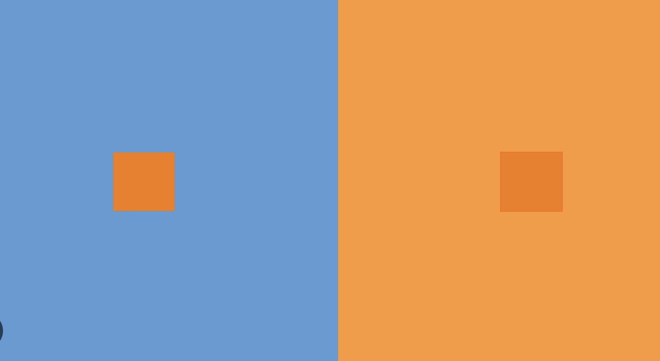
"Simoultaneous Contrast" in action: the surrounding changes our perception of color
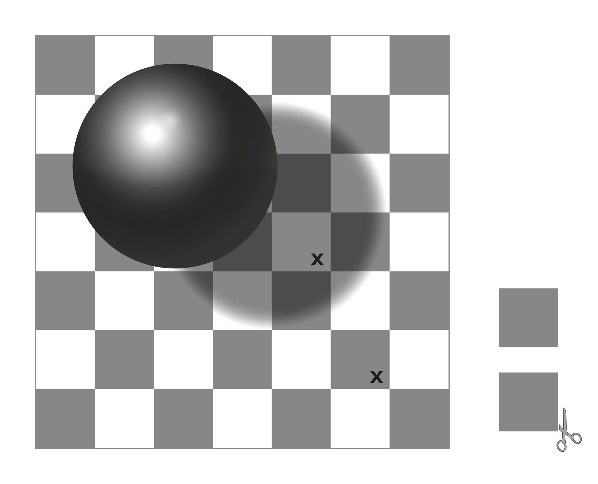
"Color Constancy": our brain keeps colours ‘stable’ — even when they aren’t
The eureka moment
Understanding this was a turning point for me. It explained why something felt wrong even when technically it wasn't. And since then, this idea sits quietly behind every decision I make — sometimes consciously, sometimes not. But every time a colour doesn't work, I know why: it's not the colour. It's the relationship.
What I've noticed — in my own work and in my students — is that this understanding evolves. First you become aware: you start to see why certain colour choices fail. That alone is invaluable. Then you become intentional: you can anticipate, not just react. And eventually, with enough experience, it becomes instinct — you've mixed and associated colours so many times that you simply know what will hold together. At that point colour theory stops being a rule system and becomes creative territory. You can bend it. Make unexpected associations and still make them work.
That's when painting starts to feel less like solving problems and more like directing them.
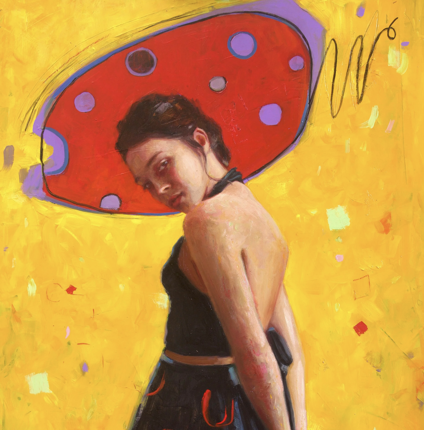
"Something in her Head" (detail) - here, I pushed fully saturated complementaries to create maximum impact.
The experiment: two differently toned grounds, two completely different paintings
In these two small portraits, I pushed this idea further by starting from two very different undertones. Because the moment you choose a colour to cover the ground, every decision that follows is affected by it.
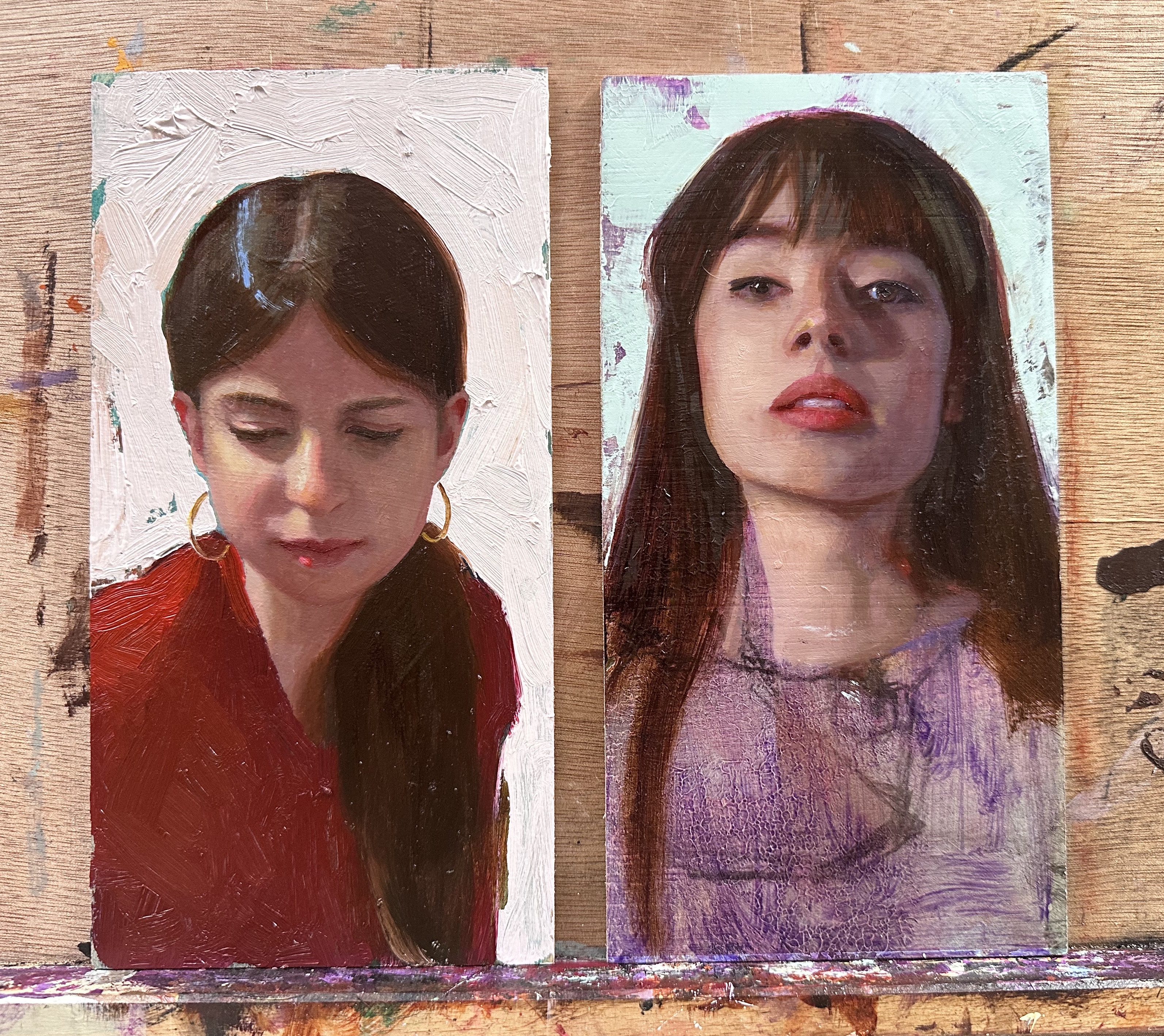
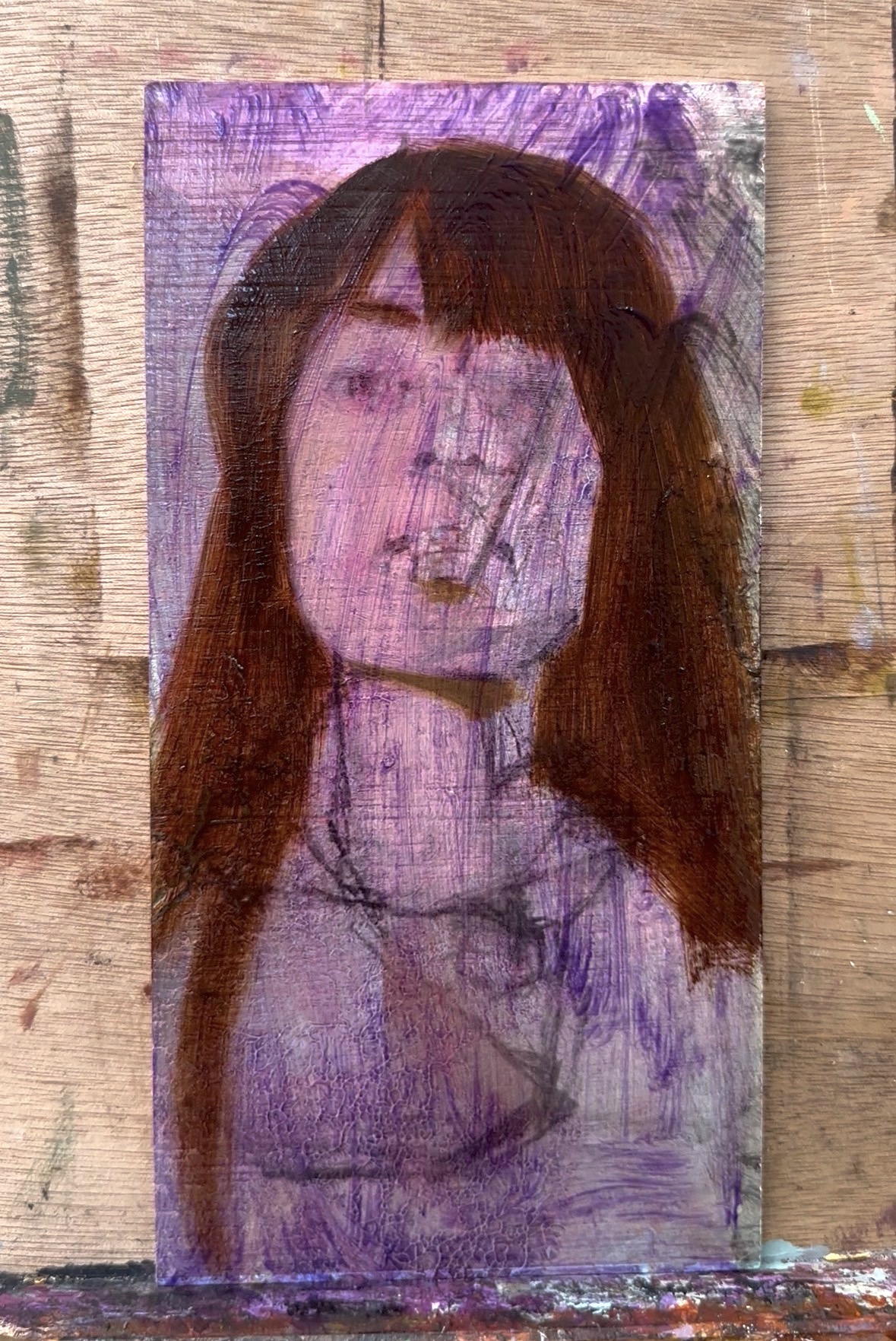
The portrait on the right: I used Michael Harding's Ultramarine Violet — a gorgeous transparent pigment that sits beautifully under skin tones. It's one of those colours that works with you. Soft enough that every subsequent decision can find a way to harmonise with it. You can see it fully exposed in the dress area of the portrait, and it became a natural part of the shadow passages. It's the kind of ground you can always negotiate with.
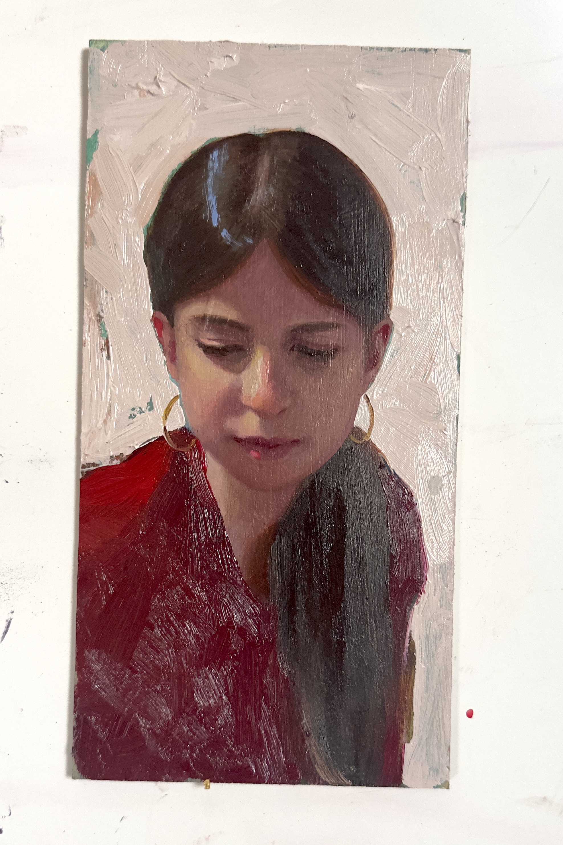
For the portrait on the left (my daughter, yes): I used Michael Harding's Aqua Green. Which I would not normally do. And I now remember exactly why.
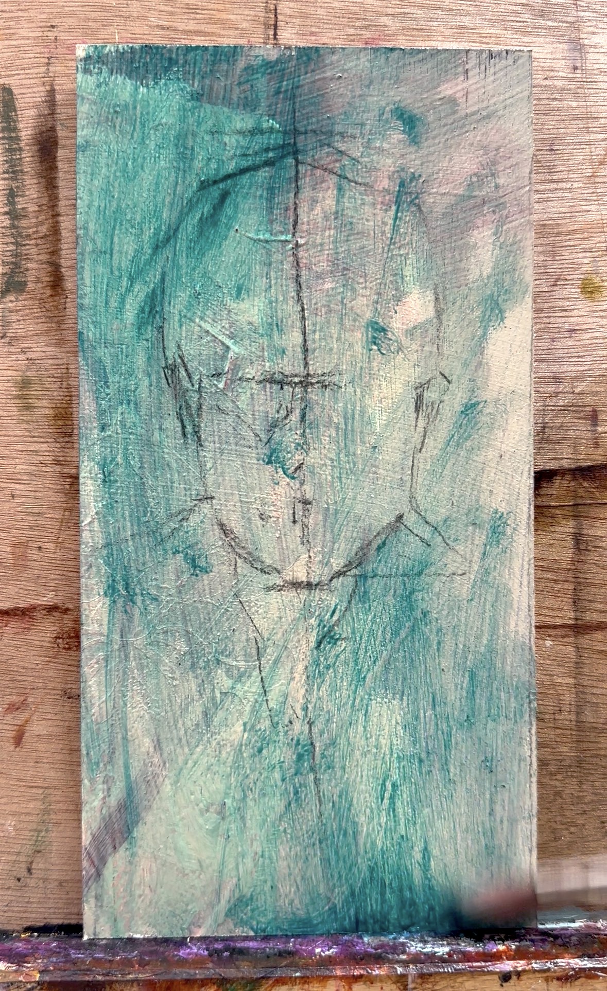
Aqua Green is highly saturated, intensely pigmented, and it does not compromise. Once that colour is on the surface, it pushes back against everything. On this occasion, at some point along the process I felt a bit cornered: my options for creating harmony became very limited, very fast. I spent most of that painting time trying to tame it — muting it, lightening it, working over it. In the end I changed the background and the t-shirt colour entirely just to bring the focus back to the face. You can see only traces of the original Aqua Green if you look closely. Hell no — Aqua Green as an undertone in portraiture is off the table for now. But it opened up interesting directions for plein air and landscape painting.
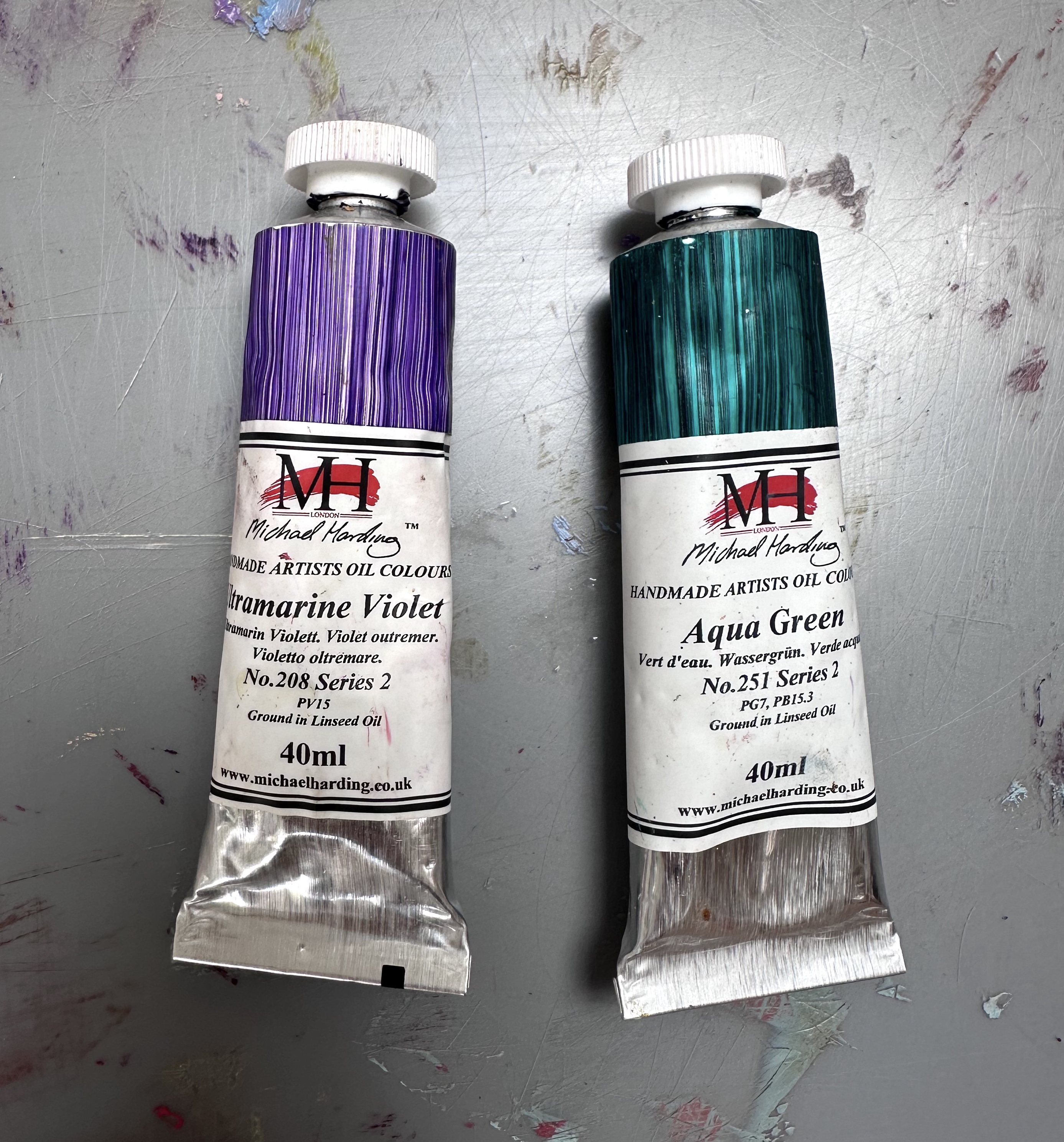
Both portraits arrived somewhere I'm happy with. But the journey was completely different — and that difference came entirely from that first tonal wash.
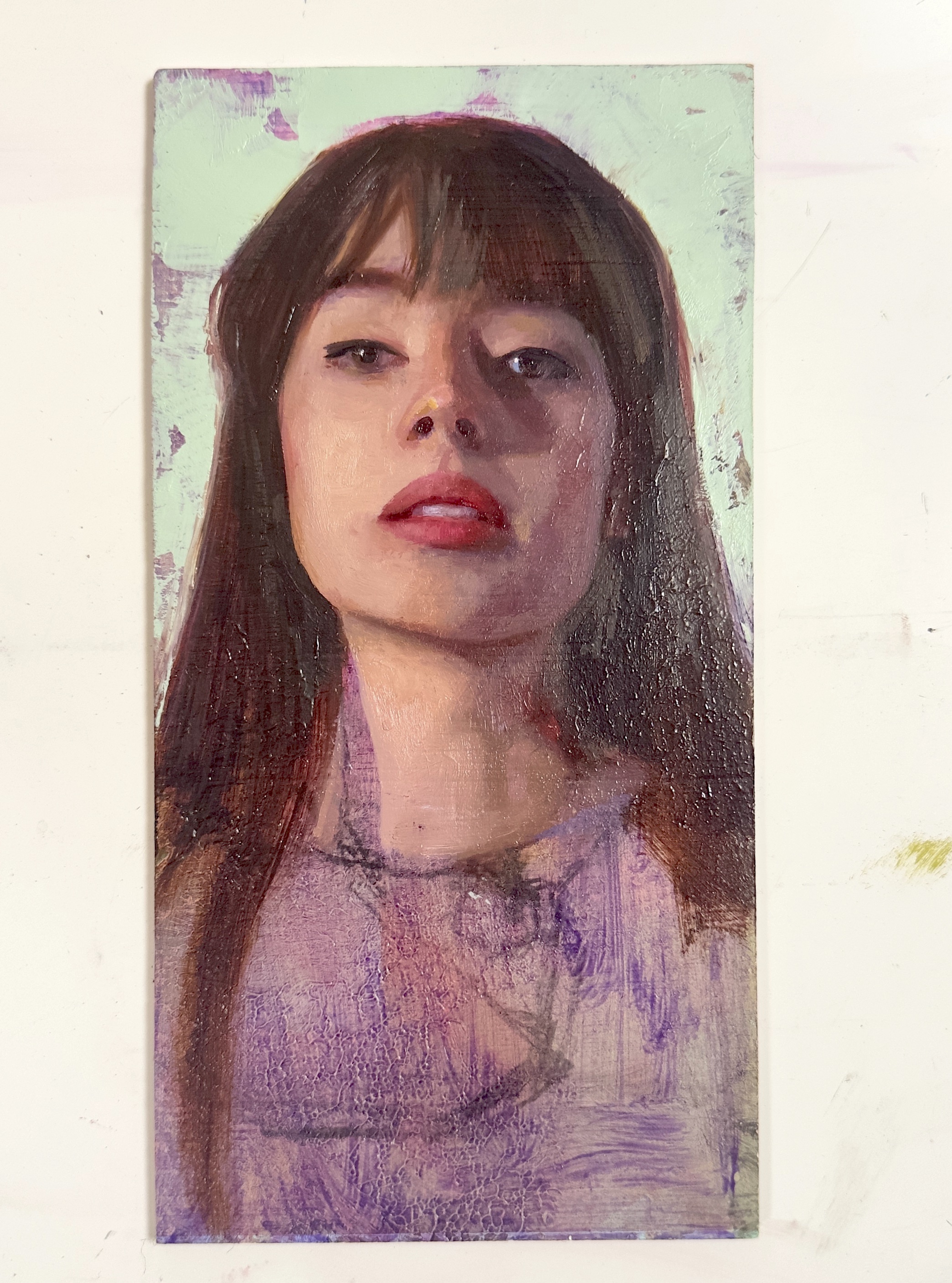
The undertone isn’t just sitting behind the painting.
It either supports you or it challenges you. And when it challenges you, it exposes exactly how well you understand colour relationships.
That's colour relativity. Not as a theory. As something you feel on the brush, in every decision, for the entire duration of a painting.
One of these portraits is still available — you can find it in my shop
If this resonates, explore more on the blog — and inside my programs, where colour theory is explored in depth.
Enjoyed this article?
Subscribe here to receive practical painting advice and more arty news.
No spam. Only thoughtful, carefully written content.