Terre Verte: My Favourite Colour for Backgrounds
Oct 21, 2026
Terre Verte is one of the ten colours that are always on my palette. I use it in two ways: in backgrounds, and to mute my skin tones.
This post is about the backgrounds.
A soft, mild green
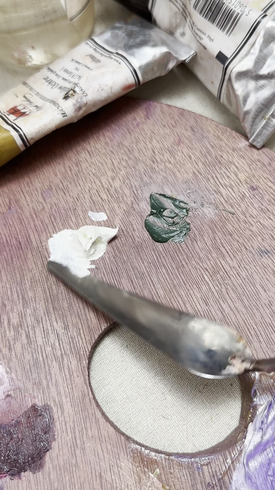
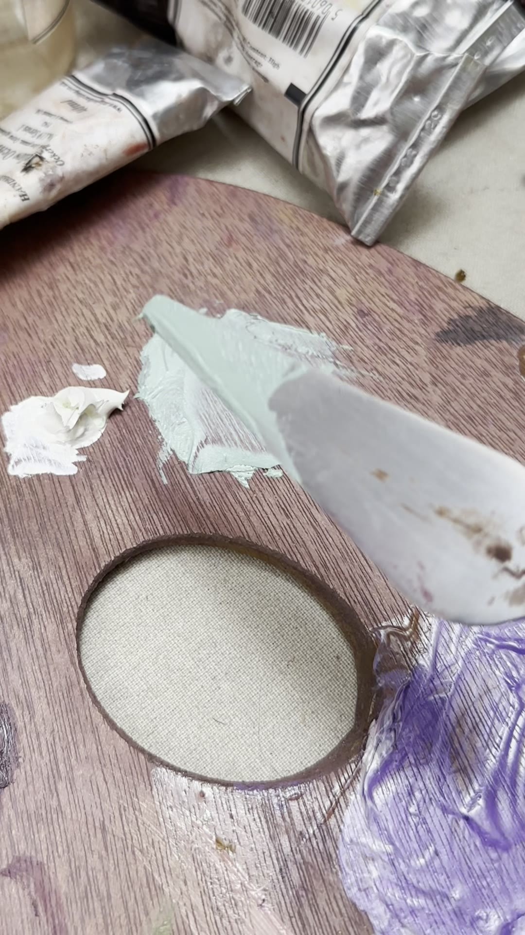
Terre Verte is a soft, mild green. When I mix it with Warm White, it becomes a lovely green-blue, like water.
Why I love it behind a figure
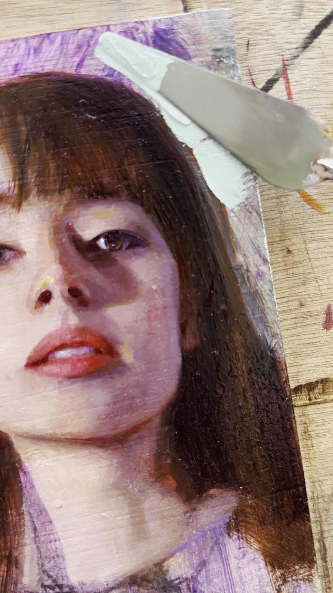
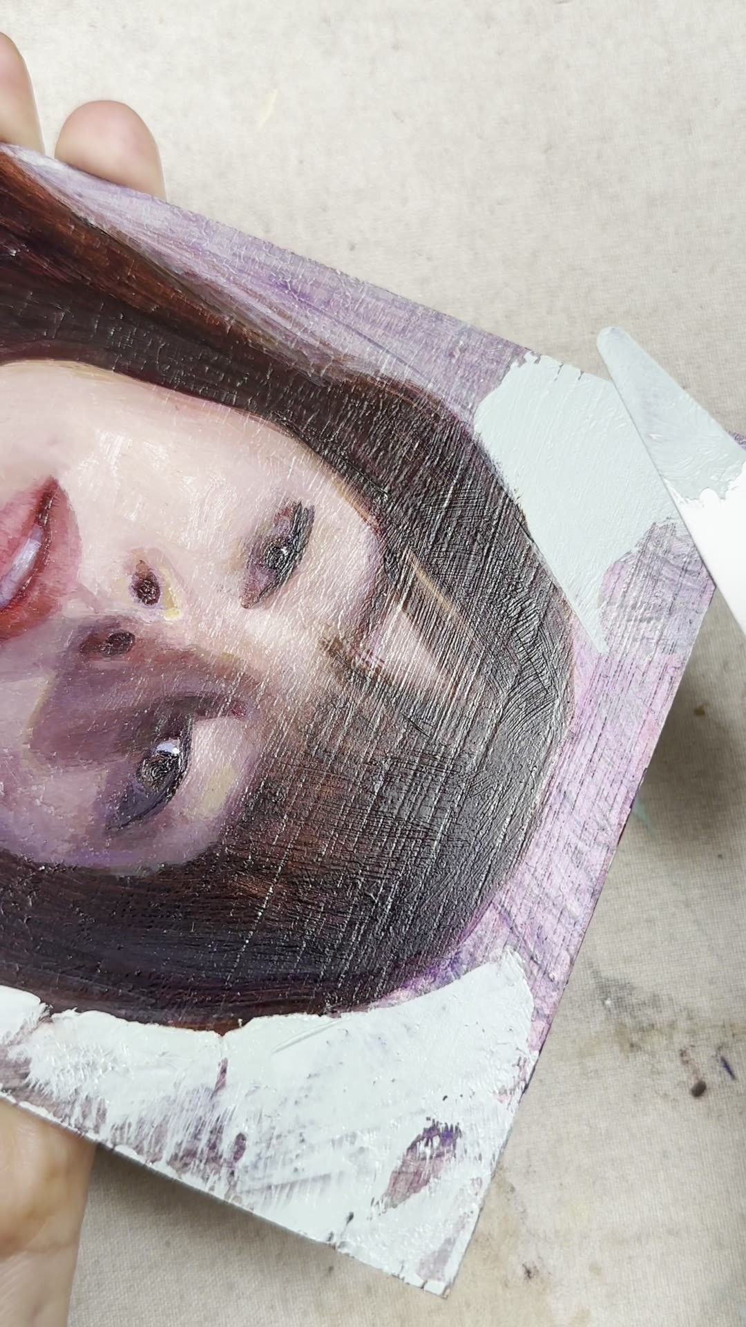
It is soft and mild, so it does not overpower the figure.
It sits around the figure beautifully, and it complements the skin. But it also stays in the back. It never competes with the portrait.
I just love that.
I also use it for skin tones
I also use Terre Verte for my skin tones, in particular to mute them. It is subtle, and it calms a mixture gently, without taking it over.
If you want to know more, watch my free colour tutorial. I show you how I use Terre Verte, and the other colours on my palette, one at a time.
Watch the free colour tutorial
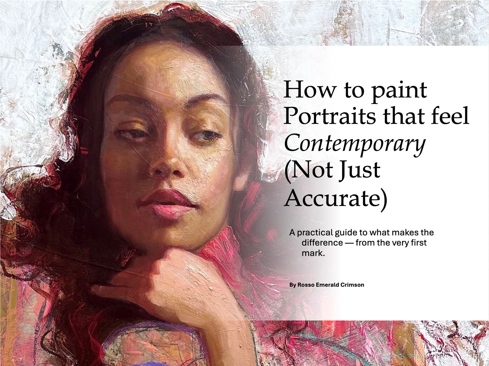
And if you want to learn how I paint portraits, download my free portrait guide.
Enjoyed this article?
Subscribe here to receive practical painting advice and more arty news.
No spam. Only thoughtful, carefully written content.