FREE ONLINE TUTORIAL
Rosso Emerald Crimson · Michael Harding · Cass Art
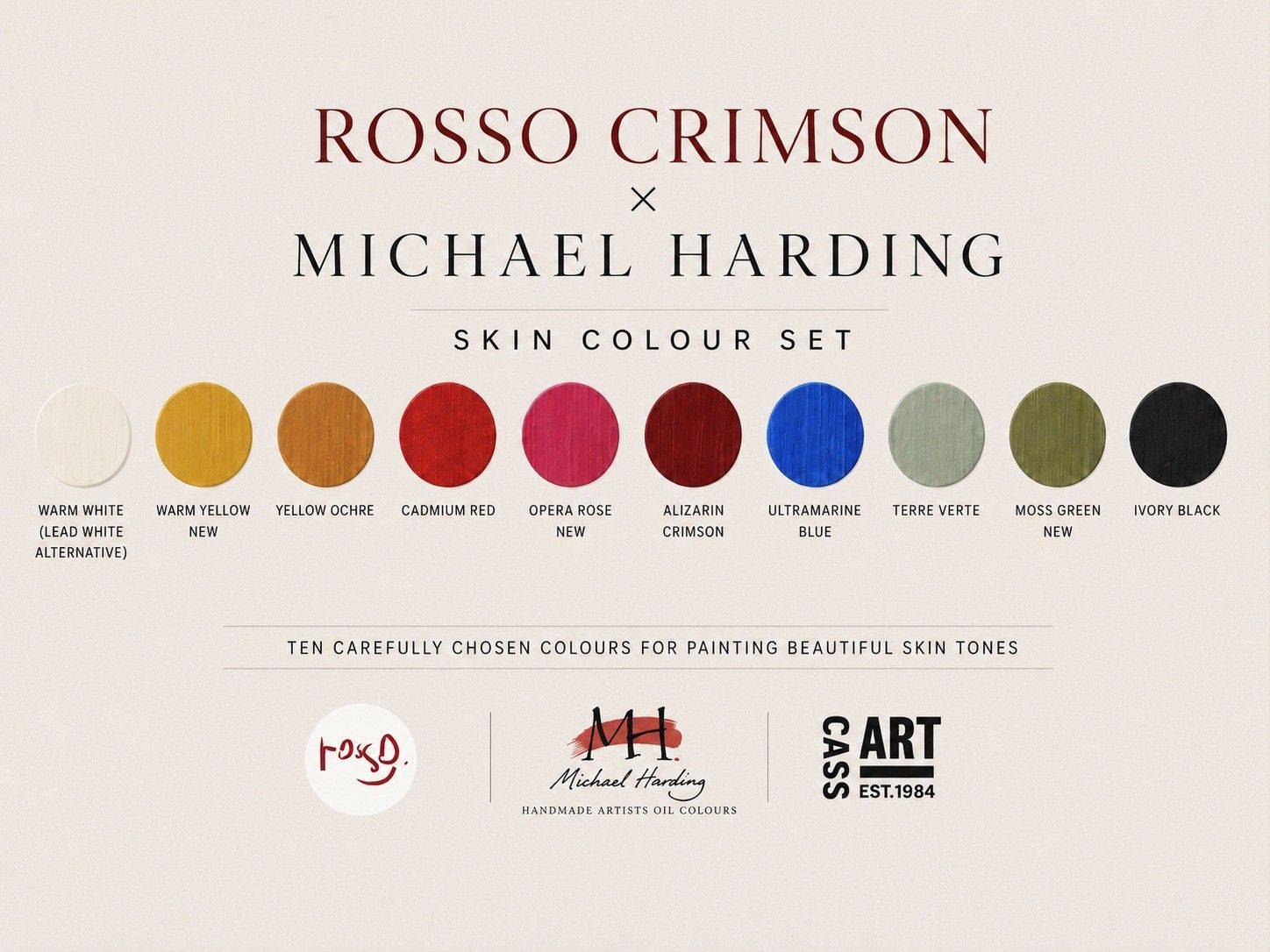
Ten colours for mixing rich flesh tones in any complexion.
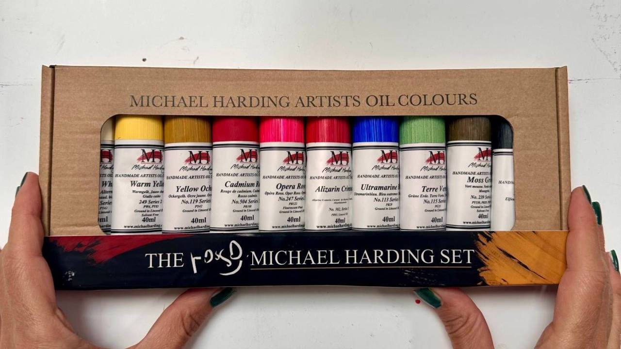
Watch me go through the ten colours I use for mixing skin tones: what each one is, why I chose it, and what happens when you mix them.
Ten practical, bite-size demonstrations, with hands-on advice and tips you can take straight to your own palette.
What's inside:
-
Inside the Set
1 lesson- How I organise my palette
-
The staples
6 lessons- The primary colours at the heart of my palette
- Yellow Ochre
- Cadmium Red
- Alizarin Crimson
- Ivory Black
- Warm White
-
The neutraliser
1 lesson- Terre Verte
-
Four More Colors to Enrich the Palette
4 lessons- Opera Rose
- Moss Green
- Ultramarine Blue
- Warm Yellow
-
Before you go...
2 lessons- When Mud Really Matters
- Let's create some beautiful paintings together
No spam. Ever.
Why this set...
When Mark Cass asked me last year whether I would like to create an oil paint set with Michael Harding and Cass Art, I was delighted. Before we had even finished shaking hands, I could already see all the colours in my head.
I knew immediately that the set had to be built around what has been my passion for the past seventeen years: portraiture, and more specifically skin.
Ten colours — but they do not all carry the same weight. I worked that out while travelling, when I could not take hundreds of colours with me and had to decide what I genuinely could not paint without.
That is how my palette ended up in three groups.
The staples
Five
The ones that are always there. Close to a Zorn palette, but enriched — two reds instead of one.
Yellow Ochre
Muted and opaque. The closest you can get to the yellow that is actually in skin.
Cadmium Red
Sits between a cool red and a warm one. Lips, cheeks, and the last highlights.
Alizarin Crimson
Transparent depth. The nostrils, the mouth, the corners of the eyes.
Ivory Black
My controlled blue. It cools a mixture without turning it violet.
Warm White
A lead white alternative. Raises the value without bleaching the colour out.
The neutraliser
One
The colour I use to mute a mixture. It goes into the case the moment there is room.
Terre Verte
Transparent and subtle. Straight from the tube it still will not take over.
The satellites (or extensions)
Four
These orbit my palette, coming and going with the season and with whatever I am painting. These four are the ones that earned their place most recently.
Opera Rose
An undertone at the start, and the brightest pink highlight at the end.
Moss Green
A warm green. Mix it into an orange for the greens Sargent puts along the jaw.
Ultramarine Blue
One sparkle in a blue eye. Backgrounds, and highlights in dark hair.
Warm Yellow
For skin too warm for ochre, without the shout of a cadmium.
ROSSOARTSCHOOL | MICHAEL HARDING | CASS ART