Colour Temperature in Portraits: Why I Use a Map Instead
Nov 04, 2026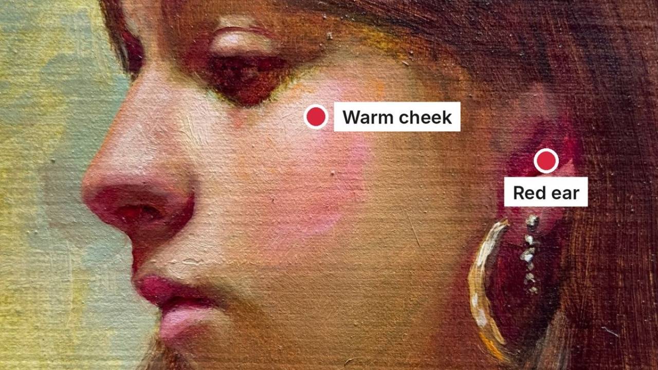
If there’s one concept that confused me for years as a painter, it’s colour temperature.
You’ve probably heard the rule: warm light, cool shadows.
But when you look at an actual face, things aren’t always that straightforward. Daylight, artificial light and light reflected from nearby surfaces can all affect the colours you see, sometimes at the same time.
Temperature is relative
And there’s another complication: temperature is relative.
We tend to label greens as cool and reds as warm, but even within those colour families, there’s enormous variation. A yellowish green can feel warm beside a bluish green. The colours around a mixture change how we perceive it, so simply calling it “warm” or “cool” doesn’t always help us decide what to mix.
I wrote more about this here: Colours Don’t Exist in Isolation.
That’s why, when I mix skin tones, I don’t spend much time thinking in terms of temperature.
A map of the portrait
What I find much more helpful is having a map of the portrait.
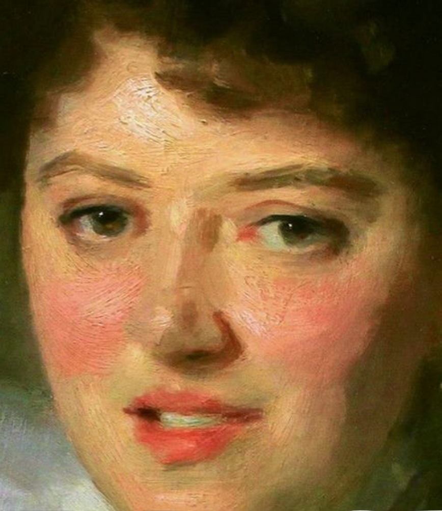
There are areas of the face where you’ll often notice particular colour shifts: places that tend towards pinks and reds, others that appear more golden, and others where you might find muted greens, greys or violets.
These are useful landmarks. They give you places to look and compare, rather than fixed rules to apply to every face. What you actually paint will depend on the person, the lighting and the colours surrounding each area.
Sorolla, Sargent and Bouguereau
You can see this beautifully in Sorolla’s portrait of his wife, Clotilde — the golden warmth on her forehead dissolves into lilacs and greens as her head turns from the light.
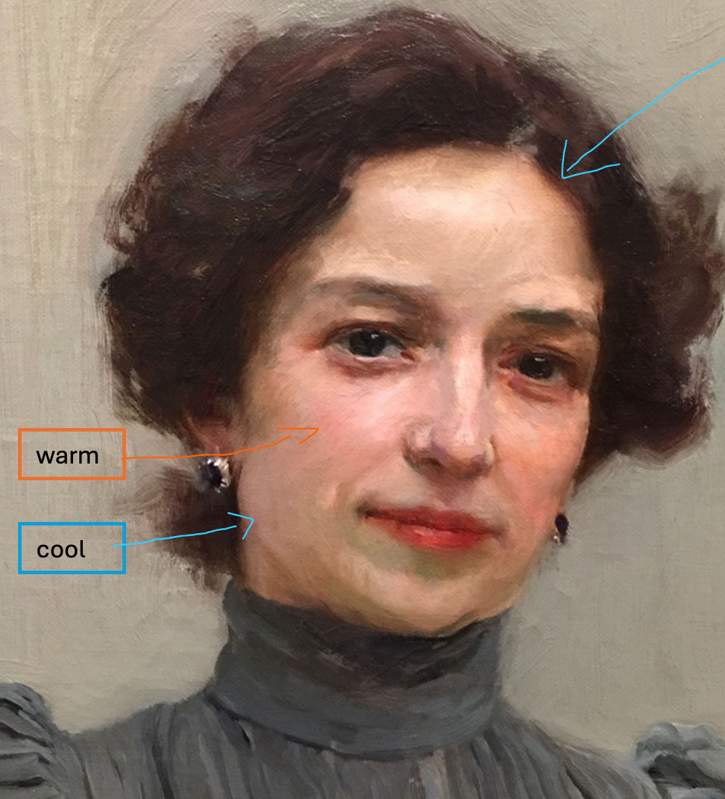
Sargent did the same — warm pinks where light lands, cooler greys and violets in the half-tones.
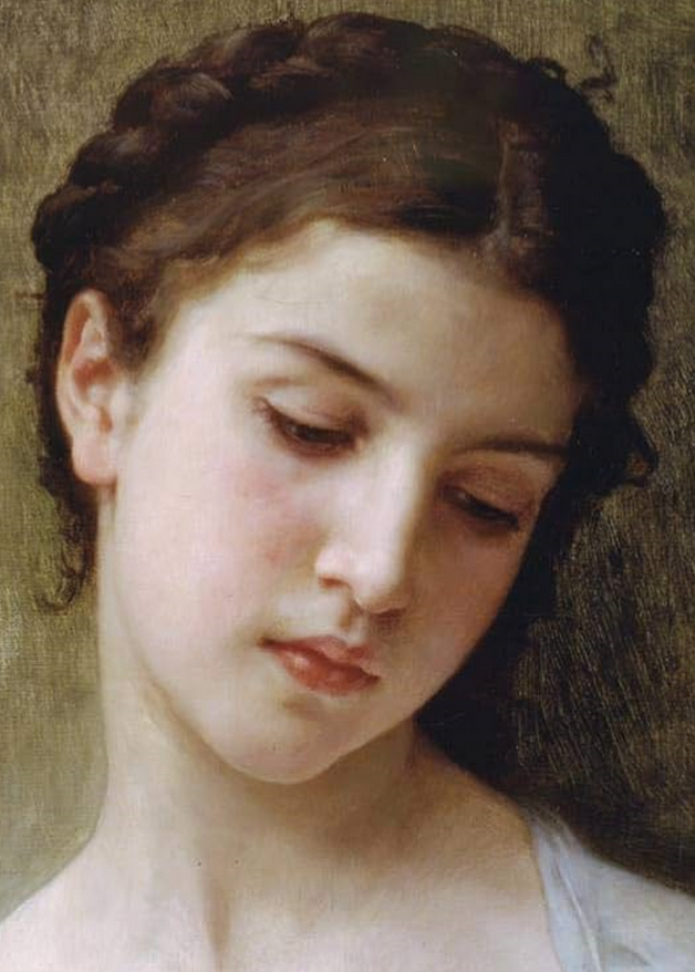
Even Bouguereau, in his highly polished style, understood this — but in his case the shifts are so subtle they almost disappear into the surface.
Enjoy exploring these colour relationships. Once you start noticing them, you’ll have much more to work with than a warm-or-cool label.
Mapping the Portrait, inside COMPLETE
To help my students put this into practice, I’ve released a specific module inside COMPLETE: Mapping the Portrait.
It walks you through these colour landmarks, showing you where to look, how to recognise them and how to use them to make more intentional colour choices in your own portraits.
It also comes with a downloadable guide to keep beside your palette and return to whenever you need a reminder.
Start with the free portrait guide
If you have not done so yet, download my free guide, What Makes a Portrait Convincing?
Enjoyed this article?
Subscribe here to receive practical painting advice and more arty news.
No spam. Only thoughtful, carefully written content.