My 10-Colour Palette for Mixing Any Skin Tone
Aug 31, 2026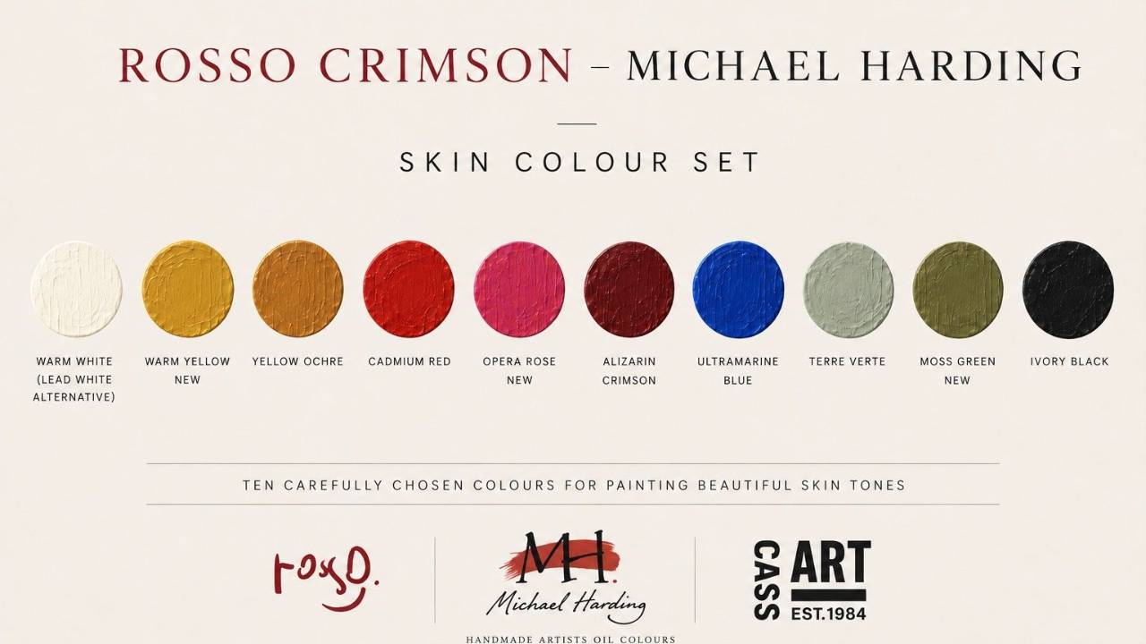
When Mark Cass asked whether I would like to create an oil paint set with Cass Art and Michael Harding, I was delighted. In fact, before we’d even finished shaking hands, I could already see all the colours in my head.
I knew immediately that the set had to be built around what has been my passion for the past seventeen years: portraiture — and, more specifically, skin.
I have painted hundreds of portraits since I started, and I keep going back to it because it is never the same twice. A different complexion, a different light, a mixture behaving in a way I did not expect — there is always something new to learn.
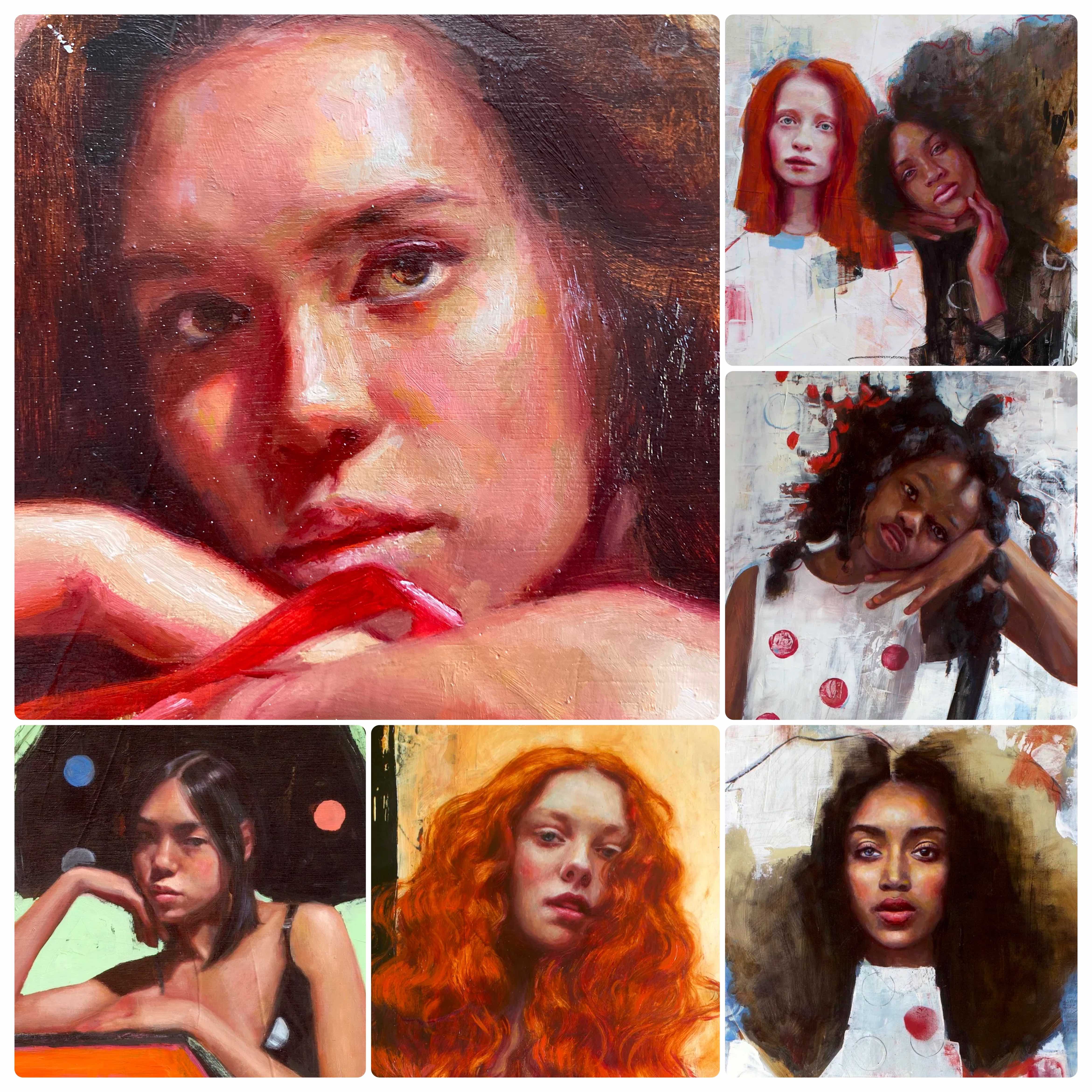
And then there are the pigments. Walk into a well-stocked art shop and you're that child again, tempted by colours you didn't know existed and suddenly can't live without.
Over the years I've experimented with hundreds of colours — and along the way I've built my own palette for skin: a small group of pigments I now know so well that painting portraits flows more easily.
These are the colours I chose for this set.
The Set.
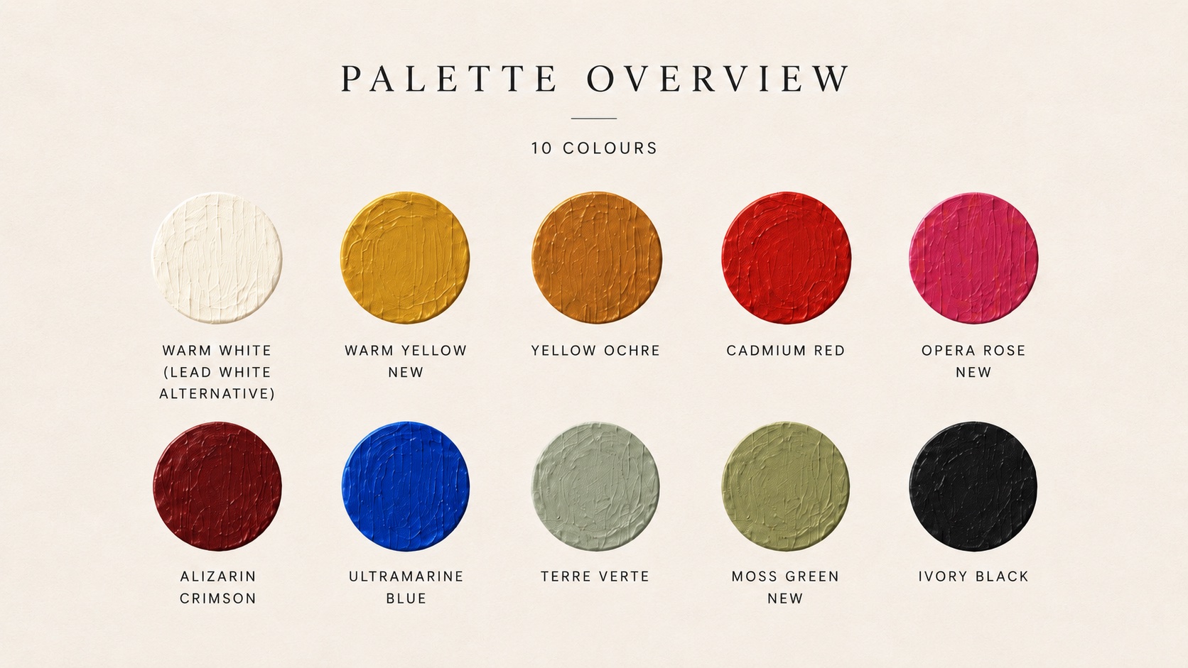
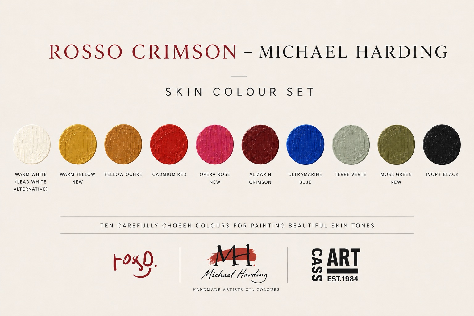
The set has ten colours, but they don’t all carry the same weight — and I mean that literally as well as metaphorically. I worked this out while travelling. I couldn’t take hundreds of colours with me, so I had to decide what I genuinely could not paint without. That is how my palette ended up in three groups.
First the staples, the ones that are always there: Yellow Ochre, Cadmium Red, Alizarin Crimson and Ivory Black, which are my working primaries, plus Warm White. It is close to a Zorn palette, but enriched — two reds instead of one.
Then the neutraliser, Terre Verte.
And finally what I call the satellites: Opera Rose, Moss Green, Ultramarine Blue and Warm Yellow. I call them satellites because they orbit my palette, coming and going with the season and depending on what I'm painting. These four are my most recent additions.
The staples
Yellow Ochre
Yellow Ochre is my main yellow for any skin I paint: pale, olive, brown, deep dark. If you look carefully, yellow is the colour you find most often in skin, and for me, Yellow Ochre in particular is the closest you can get to the yellow that is actually there.
Why this and not another yellow? Because it is muted rather than bright, and opaque, like skin itself.
Cadmium Red
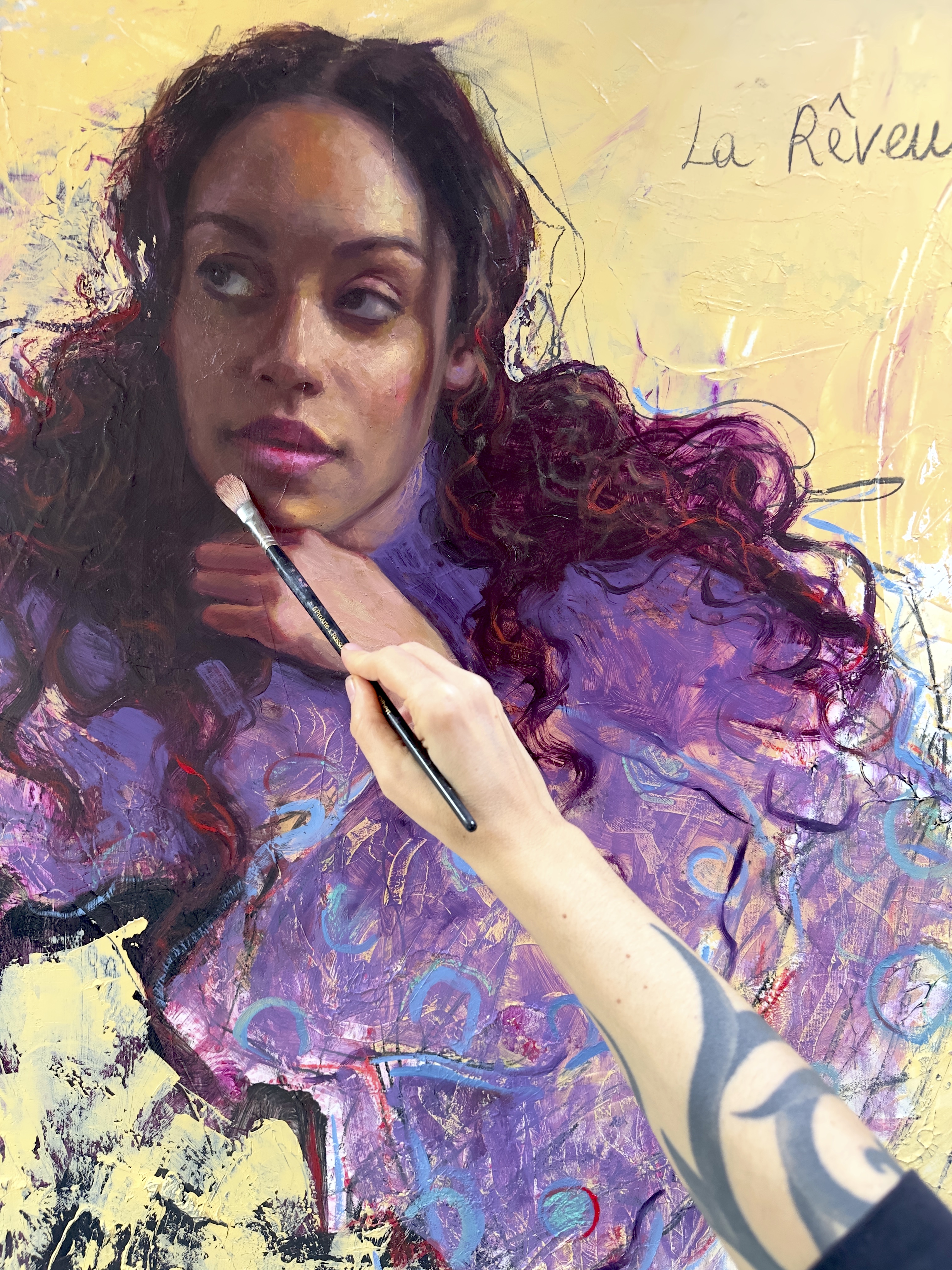
Cadmium Red from Michael Harding is a red I truly fell in love with. Most cadmium reds are warm. This one sits right on the transition between a cool red and a warm red. It is intensely pigmented without being punchy: you can look at it for a long time without your eyes getting tired.
I use a lot of red when I mix flesh. Red is blood, and it is a large part of what skin is. That is why there are three reds in this set.
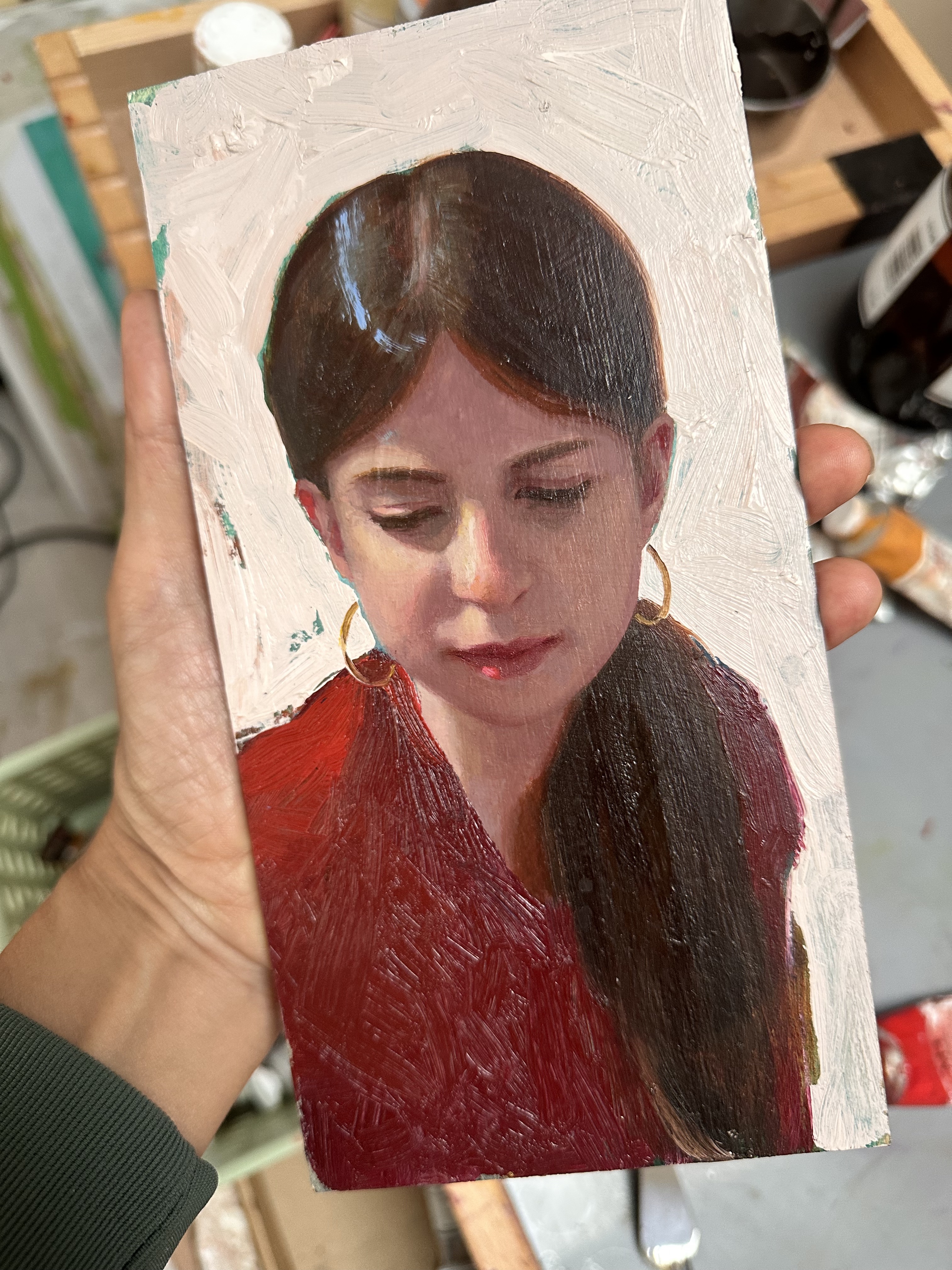
What I love it for most is those last 'signature' touches — such as, the red highlights in the hair.

Alizarin Crimson
If Cadmium Red gives life, Alizarin Crimson gives depth. It is just as pigmented, but transparent, and I use it very often as a wet-on-wet glaze.
It goes into the cavities of the face: the nostrils, the inside of the mouth, the inner ear, the corners of the eyes. Anywhere the dark is not dark enough and you want more depth, Alizarin Crimson does it.
Ivory Black
Ivory Black sits among my working primaries, because for me it is a kind of blue. Mix it with white and its bluish undertone becomes obvious.
While Blue can easily take over — put it into a red and you are in violet — Black cools, desaturates or darkens a mixture without changing the hue underneath it.
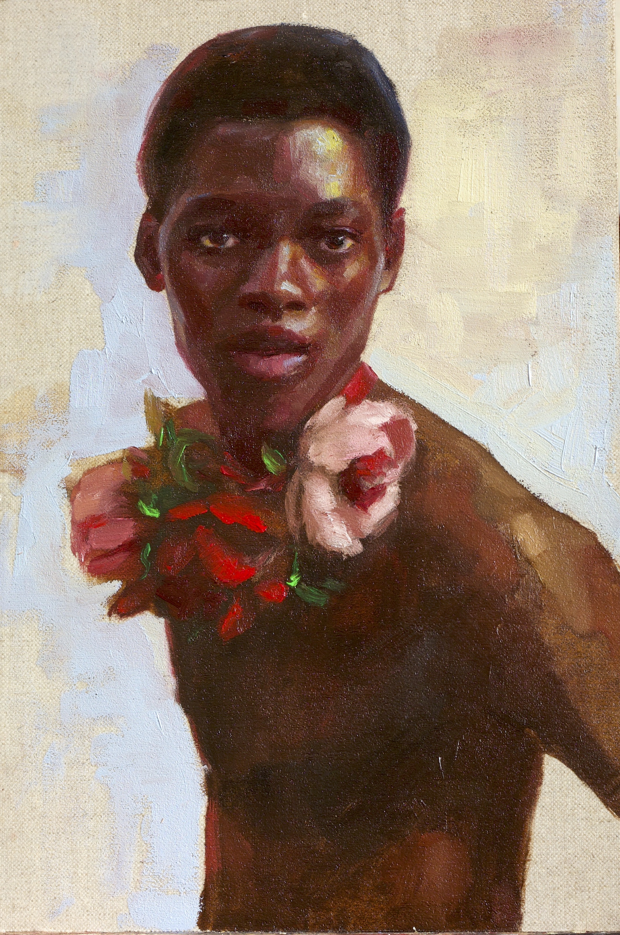
Ivory Black is my base for darker complexions: mixed with Cadmium Red it makes beautiful rich browns that don't turn brick.
Warm White
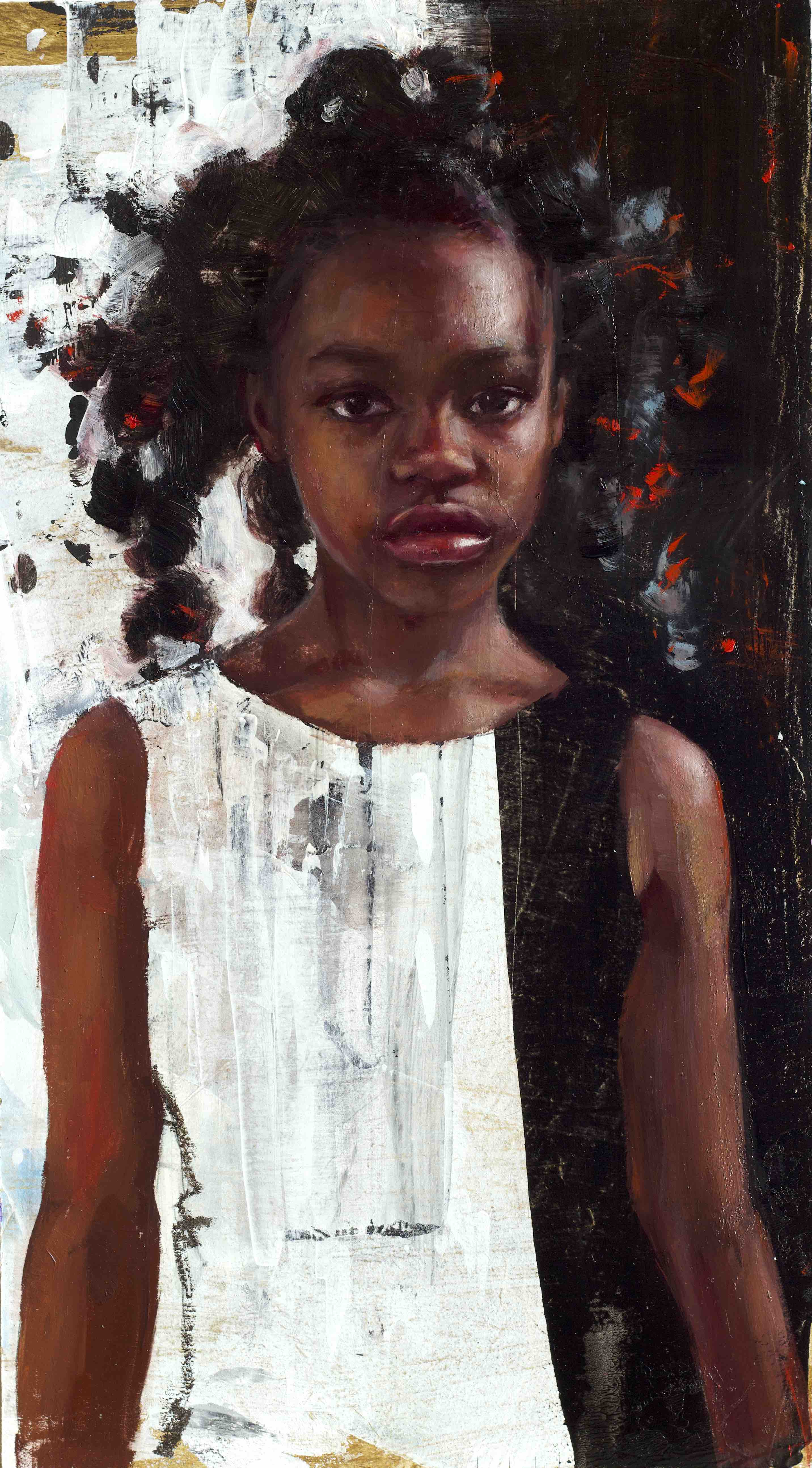
Warm White is always on my palette — I use it to lighten up my mixtures and as a base for pale skin tones. Why not Titanium White? Because Titanium bleaches. It lifts the value, but it desaturates the mixture at the same time, and you lose the chroma — the 'personality' of a colour.
Warm White has a little yellow in it. That lets me raise the value while keeping more of the character already in the mixture. For skin, that means more control.
Tip: I don't automatically reach for white every time something needs to be lighter. Often I will add yellow first, and bring in the Warm White only after that.

The neutraliser
Terre Verte
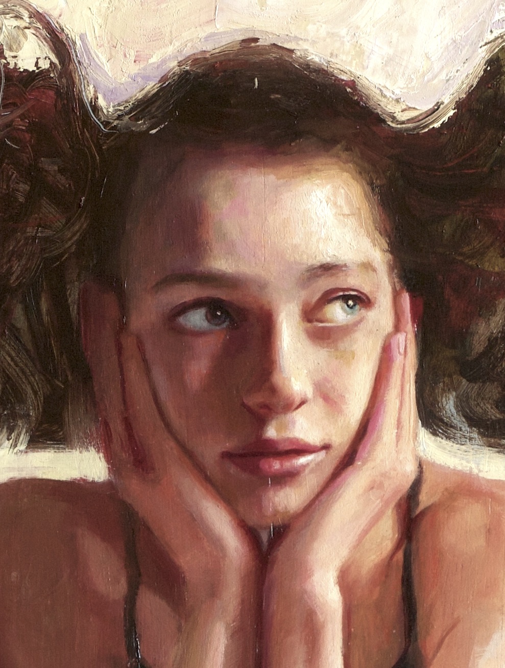
By neutraliser I mean a colour I use to mute my skin tones. You can do that with greys, light blues, or earth colours. I use Terre Verte.
It is transparent and it is subtle, and that subtlety is the whole point. It mutes a mixture gently and leaves you in control — you can put it down straight from the tube and it will not take over. It is always on my palette, and I reach for it most with pale and olive skin.
The satellites
Opera Rose
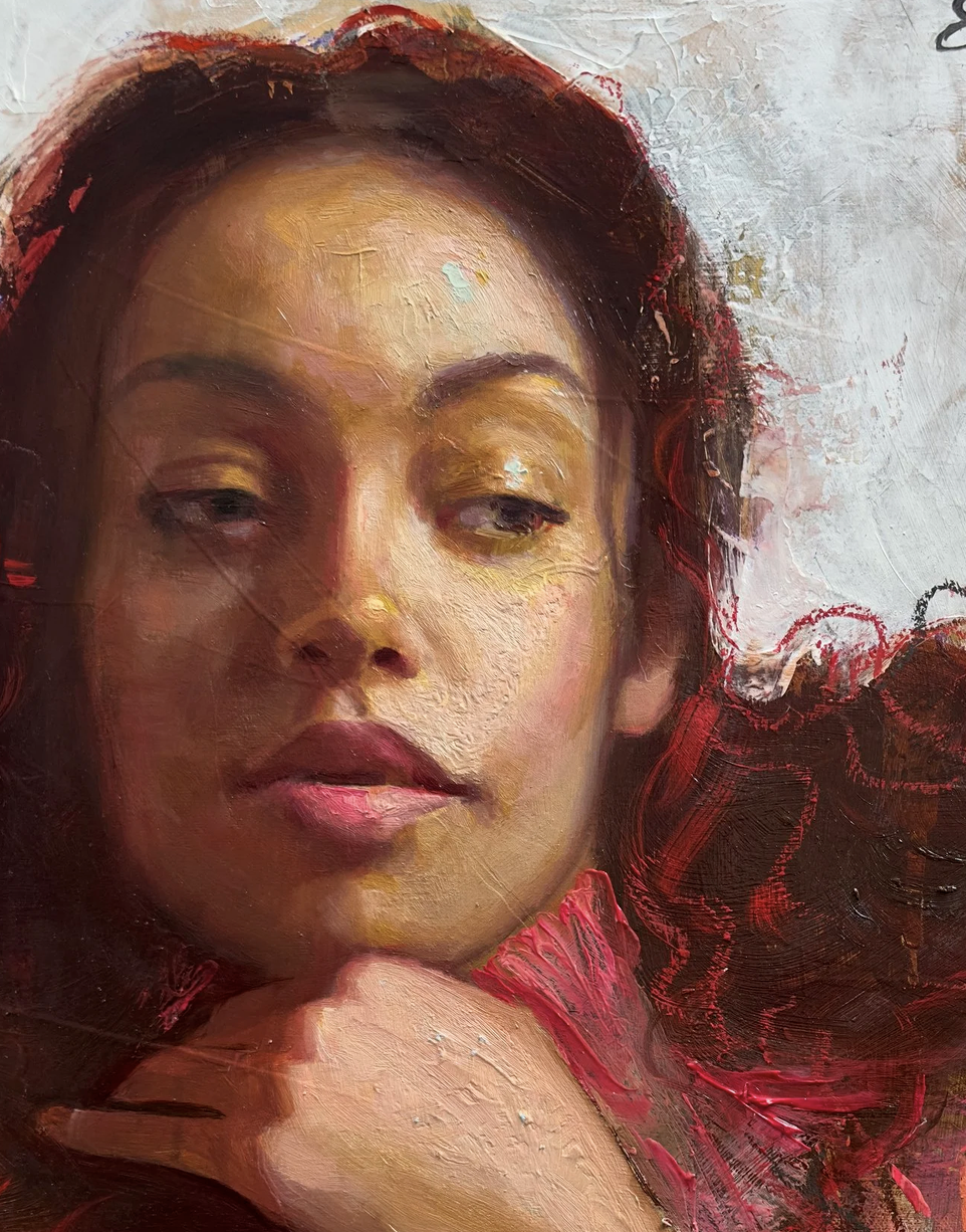
I have become obsessed with this one. It is transparent, and I use it for two very different stages of my process.
At the beginning, as an undertone: I make a wash of Opera Rose, glaze everything, and then paint on top. Underneath the skin tones it works beautifully.
At the very end, raw from the tube, for the brightest pink highlights on the lips. How many times have you put a highlight on a lip with white and watched the colour go chalky? With Opera Rose the highlight reads as a highlight — light and sparkling — and the lips stay pink.
Moss Green
Another recent discovery, and another transparent pigment. I love to use it as a wash under the skin, where it sits quietly and complements whatever goes on top. It looks completely natural.
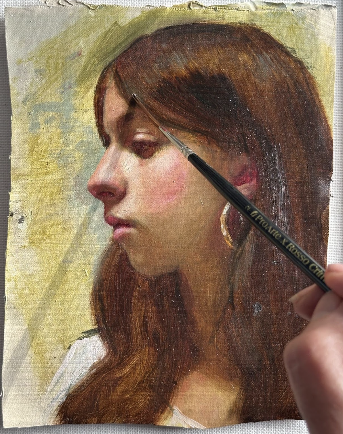
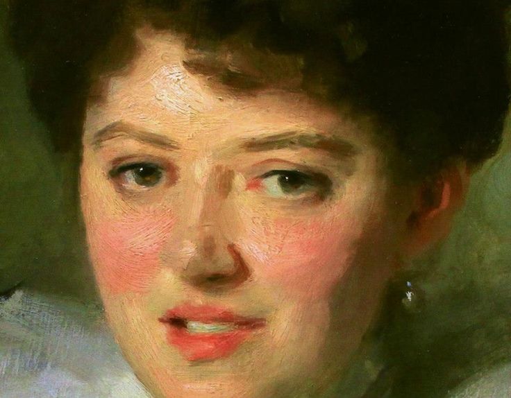
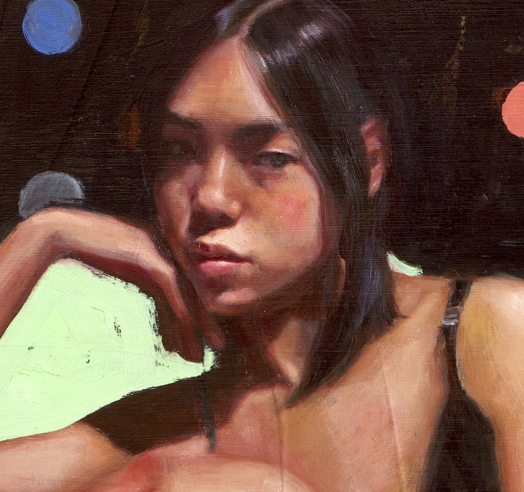
You can also mix it into your skin tones. It is a warm green, so it takes you towards the greens Sargent puts into the lower part of the face, around the chin and the jaw. Mix Moss Green into an orange and you are close to that.
Ultramarine Blue
There is always a little blue on my palette, and it is usually Ultramarine.
If the model has blue eyes I will still build them with Ivory Black, and then put one sparkle of real blue in — just enough to say these eyes are blue; I also use it often in the background around the figure, as it sits well against the skin. My favourite? Mixed with Warm White for highlights in brunette hair.
Warm Yellow
When I can't get Yellow Ochre warm enough, I reach for Warm Yellow.
It lets me mix olive and light brown skin that is genuinely warm. It is not as strong as Cadmium Yellow — it stays subtle, brightening the skin while keeping it natural.
If you want to understand more about how I think about colour — and "skin" as a colour — you will find more on the link below. There is free content to download and to watch, including videos where I show how I mix these colours on my palette.
See the ten colours and the free content
Enjoyed this article?
Subscribe here to receive practical painting advice and more arty news.
No spam. Only thoughtful, carefully written content.