This is how you start a portrait: simple.
Jan 27, 2026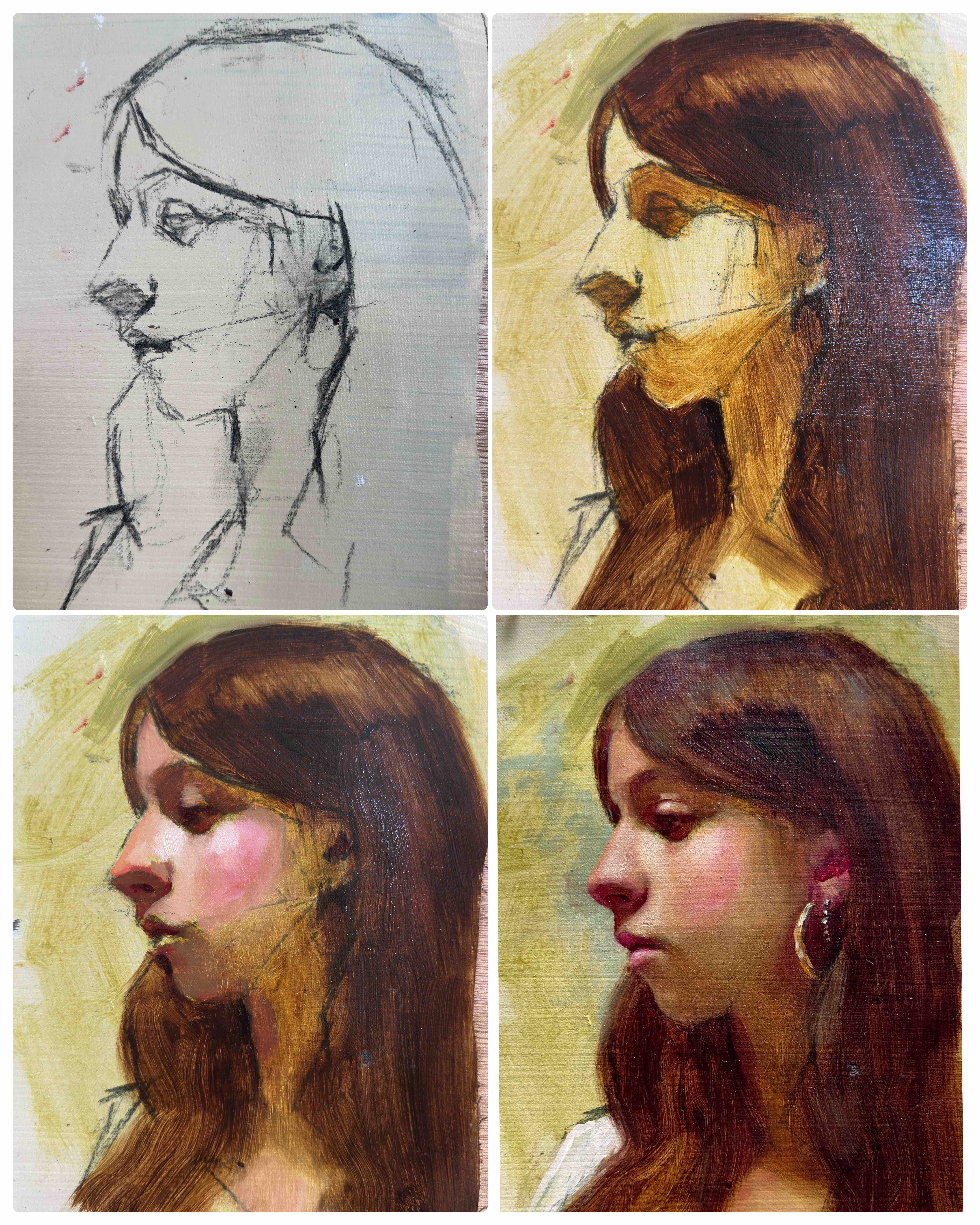
Today I want to talk about what is, for me, the most radical shift we must make to paint solid portraits.
We need to learn how to observe the subject matter — long before we focus on technique.
This isn’t a cliché. It’s a real, fundamental game changer.
The most common mistake beginners make is painting what they think they know — the symbols we learned growing up (eyes as almond shapes, for example). We end up using the brush like a pencil, “drawing” with paint. The result is often a portrait that feels cartoonish or slightly off — and we don’t understand why. (I say “we” because I started exactly the same way, with a head full of preconceived ideas.)
Observing a face as a painter means simplifying — but differently from how we were taught as children. In realism, simplifying means seeing shapes and how they connect. The eyes are shapes within the eye socket. Everything can be reduced to a general shape and read in relation to what surrounds it.
That is the absolute foundation of strong, solid realist portraiture.
Once that foundation is in place, then we move on to understanding light — how it affects what we see on the surface. Skin colour, the temperature of shadows, those tricky mid-tones that don’t fit neatly into one label. We learn how light sculpts form as it travels across it.
Every time I paint this way, I feel genuinely excited. It’s pure poetry. Imagine being a painter of light moving across form — whether it’s a tree, a landscape, an urban scene, or, in our case, a face.
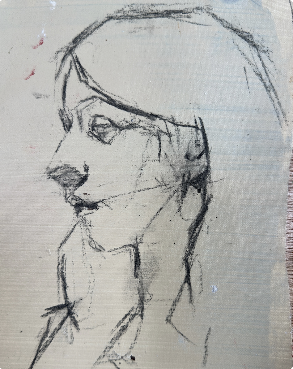
This image explains what this looks like in practice.
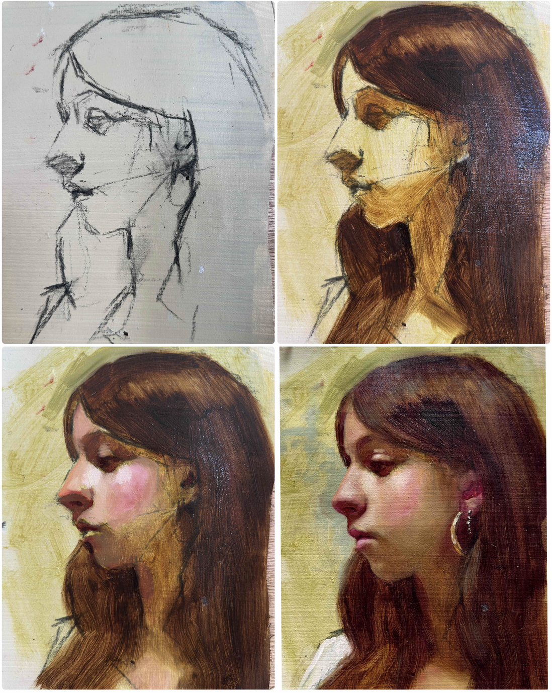
IMAGE ONE
This is how I always start. Not with a tight, precise drawing — but with lines. Intersecting lines, used almost like a compass: searching for intersections, making connections, locating facial features while simultaneously measuring the distances between them.
On a good day, this initial mapping takes about five minutes. On a bad day — when I'm tired, mentally or physically — it can take much longer, until my hand and my eye finally decide to cooperate.
If you're a beginner, this is one of the most essential stages, and the one where you really shouldn't rush. Because regardless of your medium, regardless of whether you're painting or drawing — in realist portraiture, it's all about getting those relationships right.
So don't worry if your lines feel messy. Keep going with this approach. It gets better, and faster.
I was working in charcoal here, on linen.
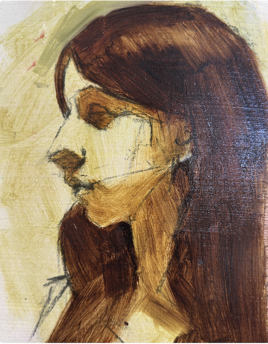
SECOND IMAGE — The Wash and Blocking-In
This is where the actual painting begins. First, I fixed the charcoal drawing with fixative. Then I went in with a thin wash of Mosso Green — a wonderful transparent warm green from Michael Harding. From there, I started blocking in the main dark areas — shadows and hair — with a thin layer of burnt umber.
That's it. No details. No blending everything smooth. Just simplifying, searching for the main shapes and connections.
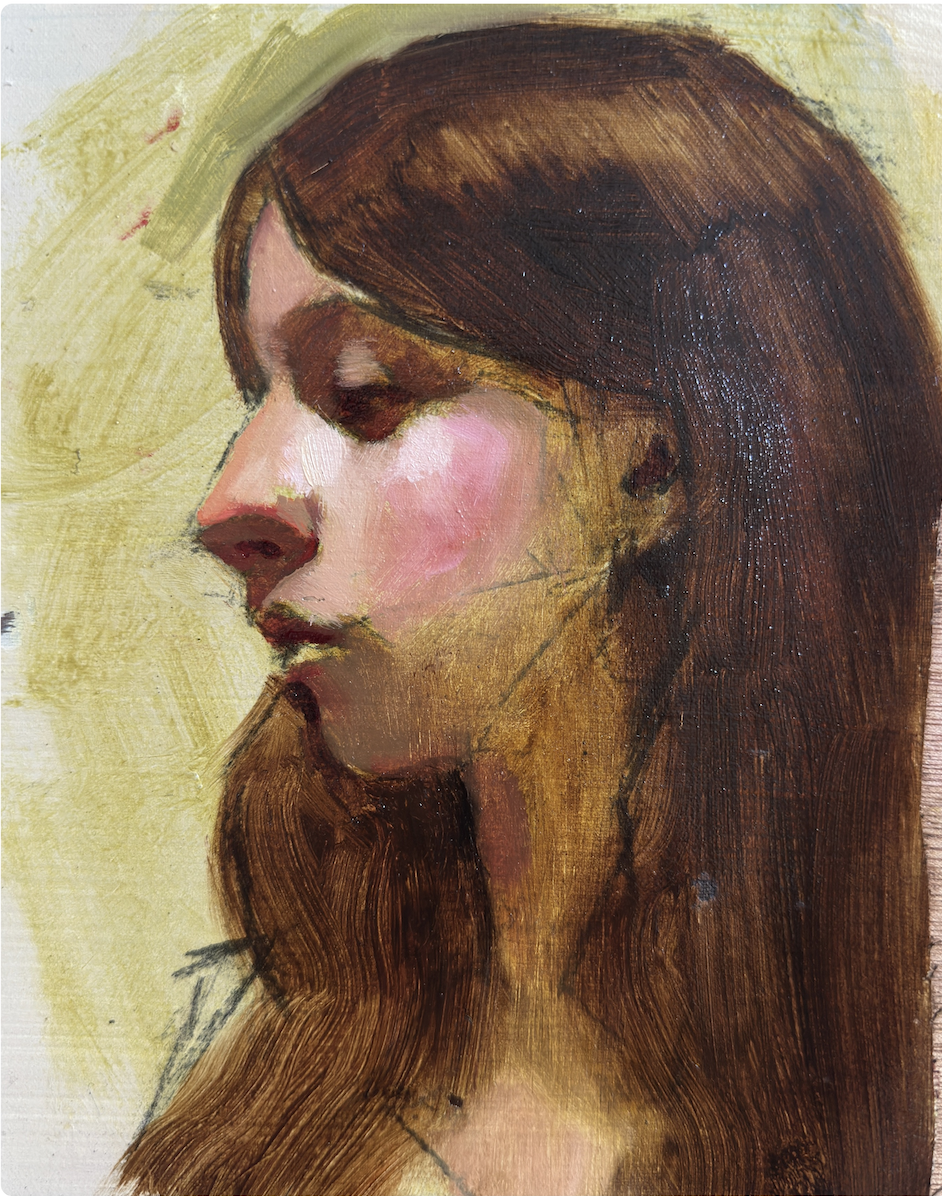
THIRD IMAGE — Modelling
By this stage I've already worked out the major tonal variations in the light areas — rosy warm cheeks, a darker but still warm forehead and upper face. Notice how I play with the contrast in opacity: the parts of the face exposed to the light sit against the transparency of the areas in shadow.
I love that interplay, and I made a conscious decision early on not to cover the shadow areas with thick paint.
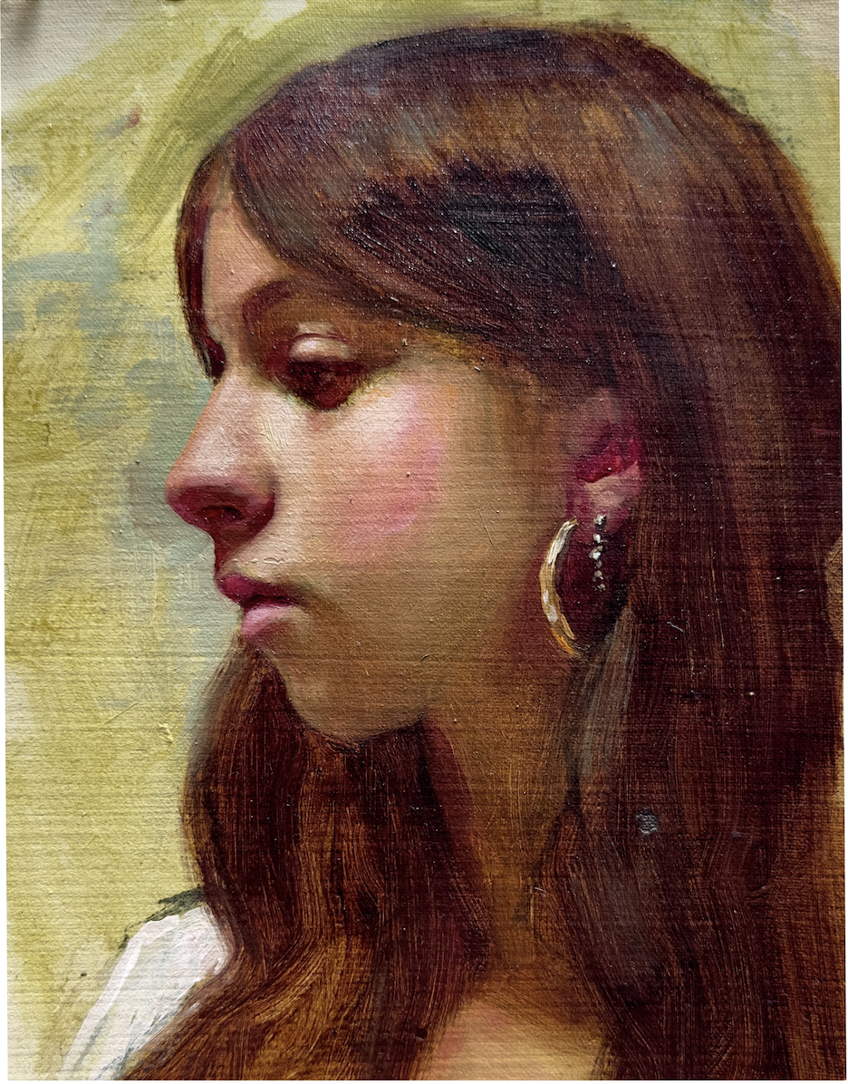
FOURTH IMAGE — The Final Painting
Once I established that my main focal area was the upper part of the face — directly exposed to the light — I left the shadows deliberately semi-transparent and relatively flat.
A few other things worth noticing: the reds around the nose, the corners of the mouth, under the eyes, and inside the ears. These areas are typically warm — observe a friend or yourself in a mirror and you'll see it straight away.
I personally love to push this and use Alizarin Crimson for those final tiny warm accents. It's a very personal choice — you don't have to emphasise it as much, and softer, more subdued reds work beautifully too. But I always finish my paintings with either raw Alizarin Crimson or vivid Cad Red. It's my signature touch — which is exactly why it's in my name. 😉
If you'd like to watch the full process, you can see it for free here: Watch the process
If you'd like to learn how to paint portraits in my style, explore my START Program .
If you want to go deeper into this framework:
Did you know you can learn with me both online and in person?
Enjoyed this article?
Subscribe here to receive practical painting advice and more arty news.
No spam. Only thoughtful, carefully written content.